WebEngage Marketing Graphics
A collection of Web Pages, Ads, Social Media, Presentations and other marketing collaterals.
WebEngage empowers all attributes key for Marketing, Growth and Retention. It houses customer data platform, an omni channel engagement campaign orchestrator, a personalisation engine and an immersive analytics engine. WebEngage actions, optimises and orchestrates triggers, segments, behaviours and funnels. AI enabled recommendation, predictive outputs and profiling. WebEngage is built with the sole intention of improving retention and Sharper analytics based engagement, all wired to run marketing automation emphasising the OKRs of churn handling, growth plaques and customer dormancy.
WebEngage:
Brand Building for a Customer Retention Platform
SERVICES PROVIDED
WEBSITE GRAPHICS
ILLUSTRATION
BRAND STRATEGY
MARKETING GRAPHICS
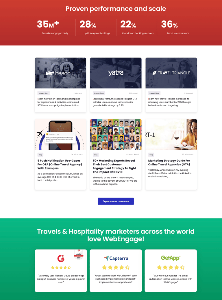
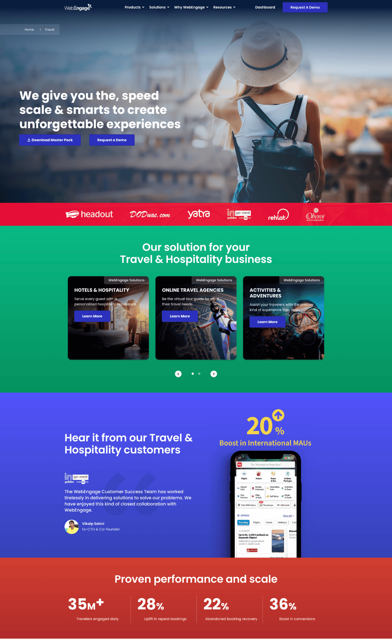
Earlier Website
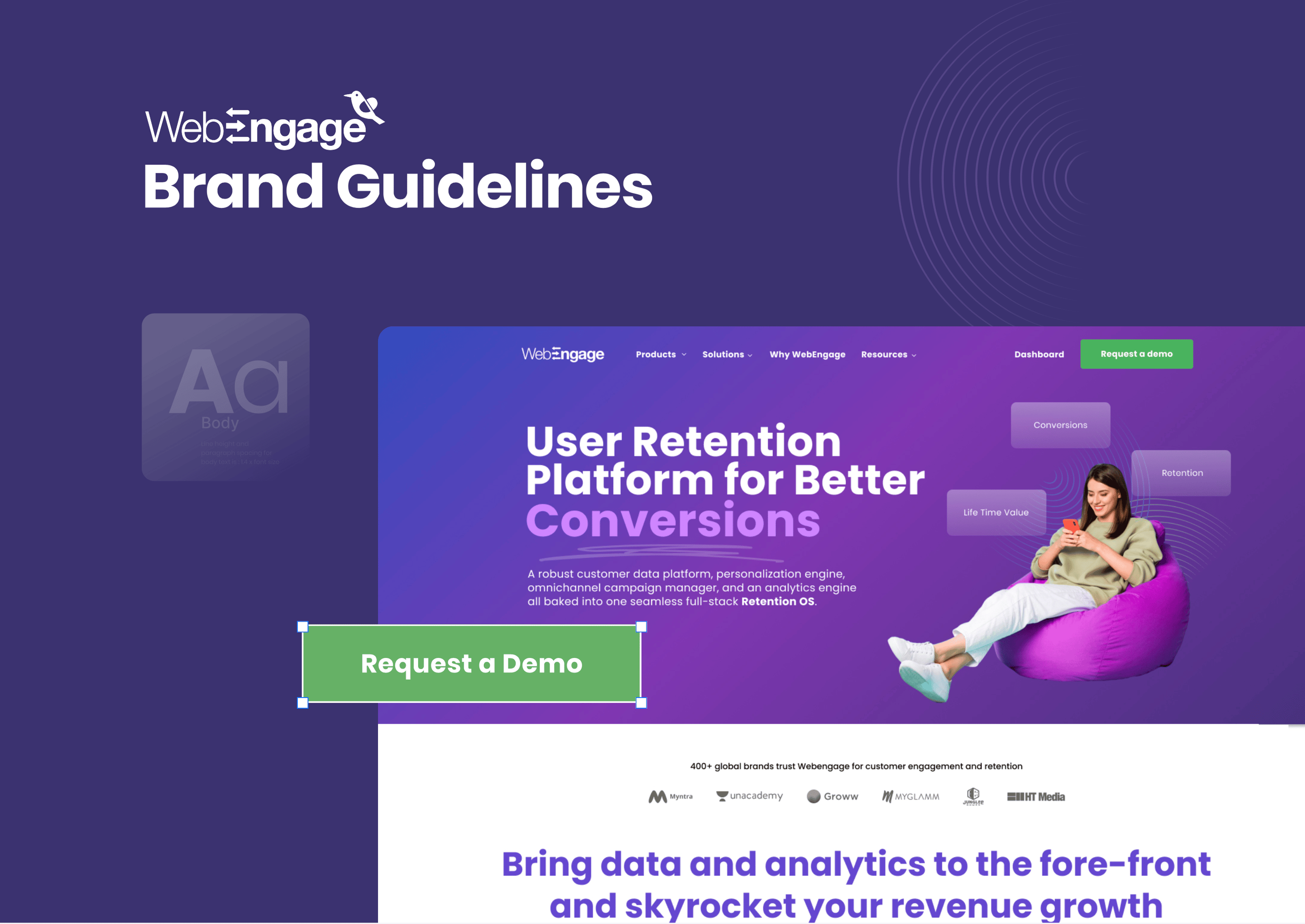
The earlier site uses at least five different vibrant colors—each for a section background—which felt disjointed and chaotic.
Sections like "Proven Performance and Scale" and the testimonial areas are too dense with stats, logos, cards, and quotes all crammed together.
No breathing room or whitespace makes it difficult for users to scan and digest content.
Poor readability and accessibility
Invisible CTA structure

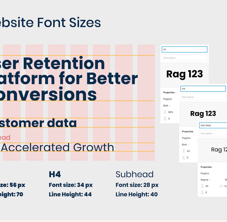

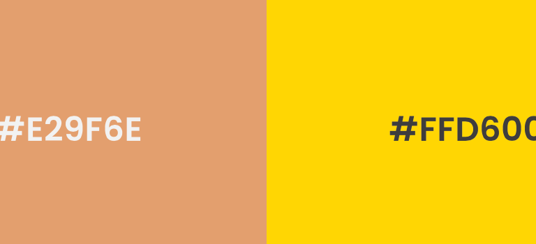

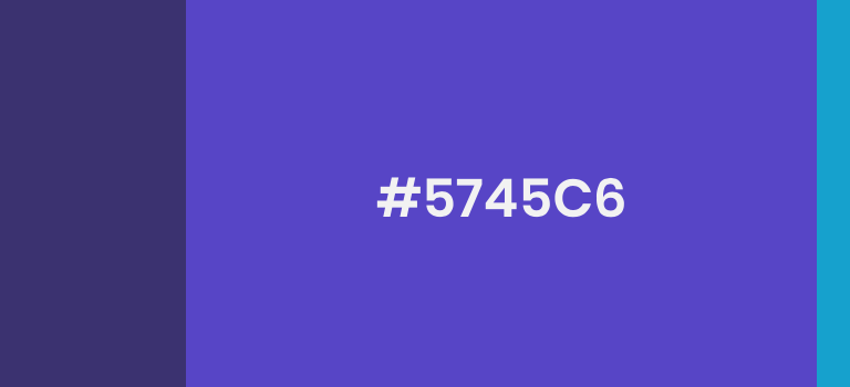


Brand Colours & Typography
Hello, sophisticated, fresh colors.
The visual system has polish and personality: premium typography adds status, curated photography feels editorial and genuine, and ownable illustrative pattern work exudes energy and movement. The color palette consists primarily of tonal purples that communicate depth, introspection, and connection.
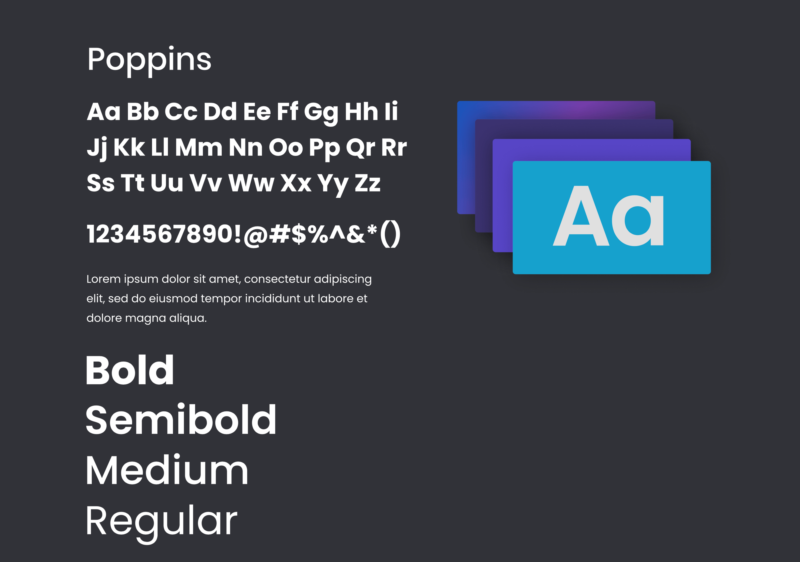
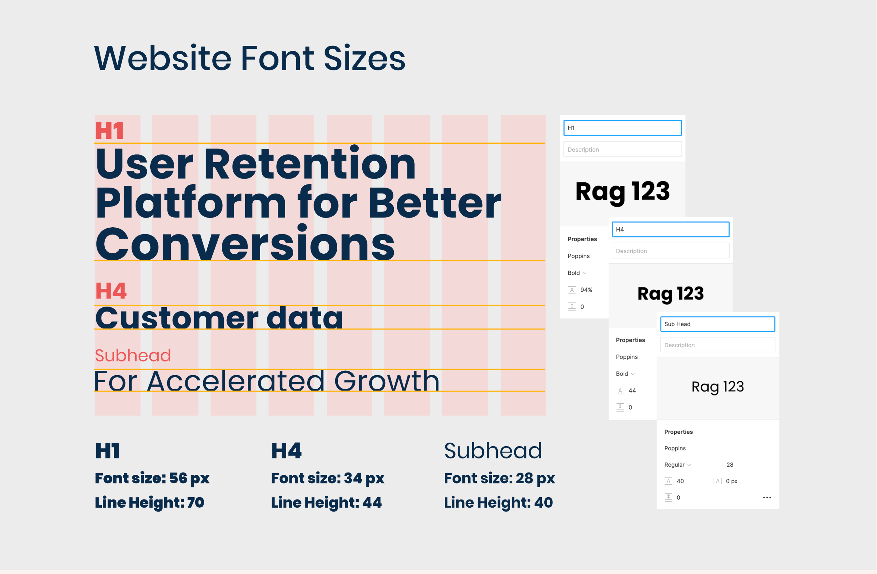
Poppins is a versatile, geometric sans-serif typeface. It has clean, monolinear strokes and a contemporary feel, making it suitable for use in headings, logos, and web design. Its polished look makes it a go-to for designers seeking a sharp, modern style. The best part is that Poppins has great multi-lingual support, due to having an extensive character set. Poppin’s consistent stroke contrast also creates a clean and minimalist look.
Primary
Gradients
Secondary
Website Pages
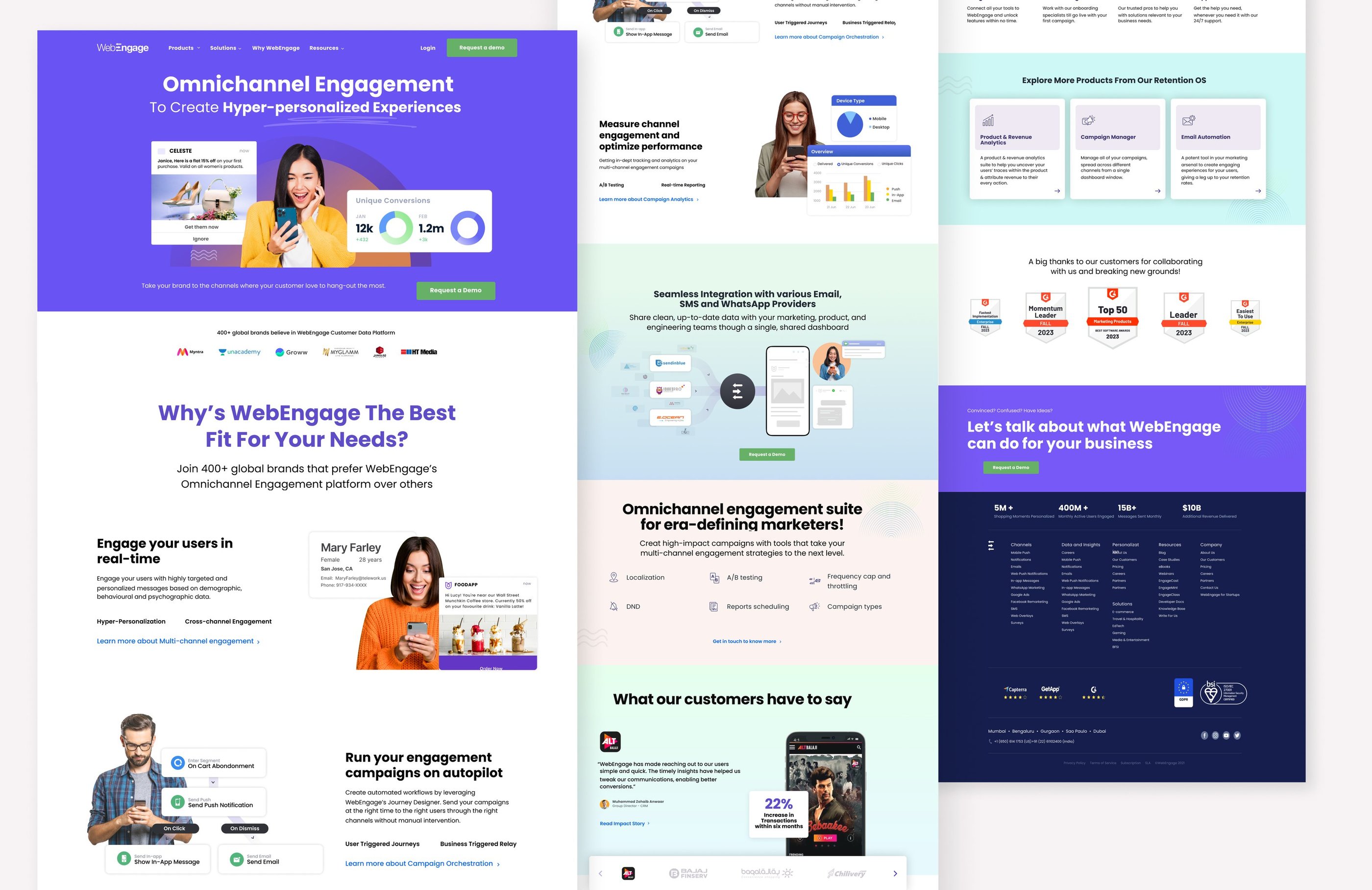
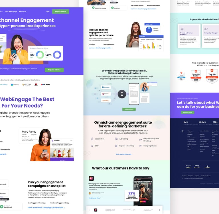
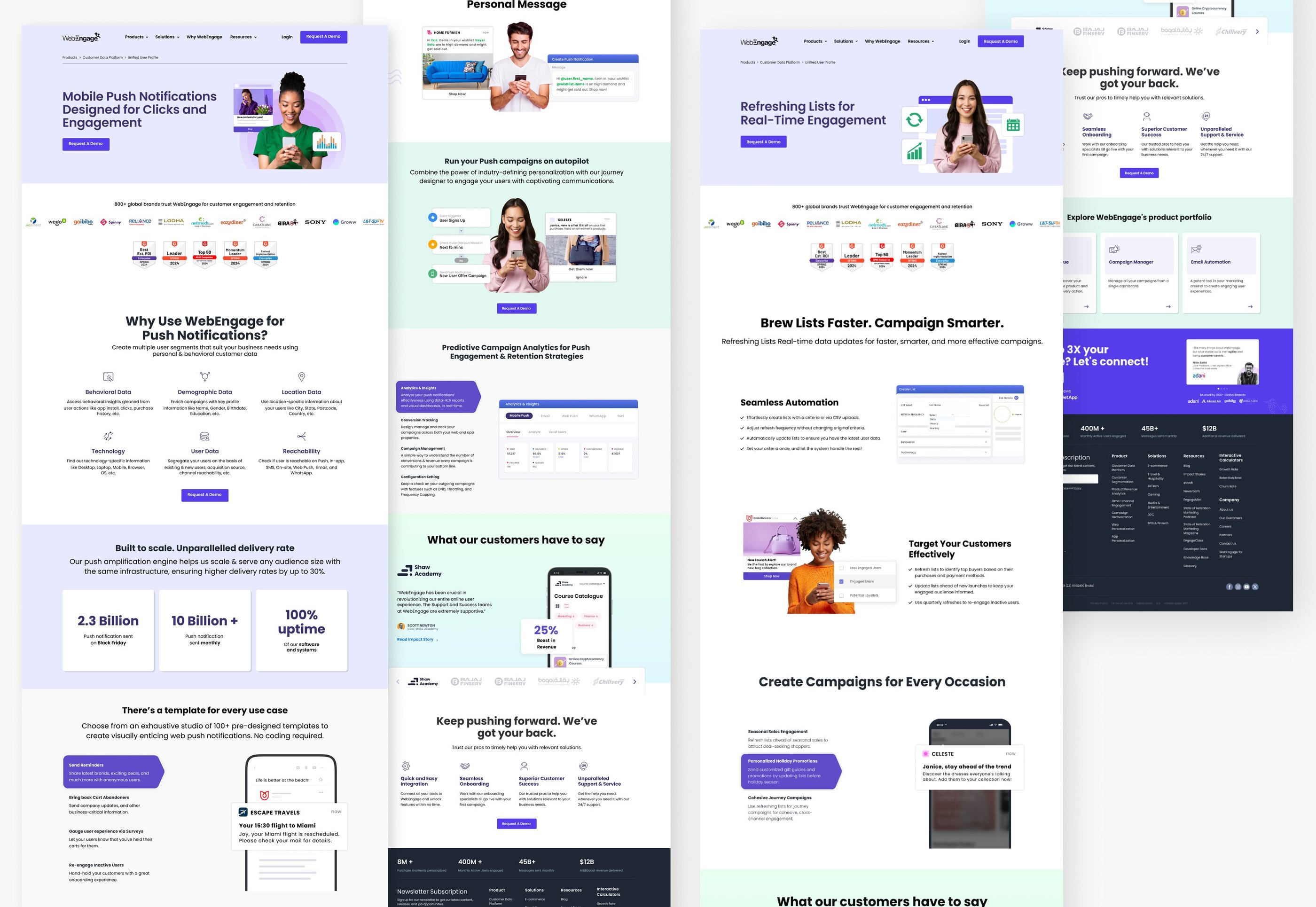
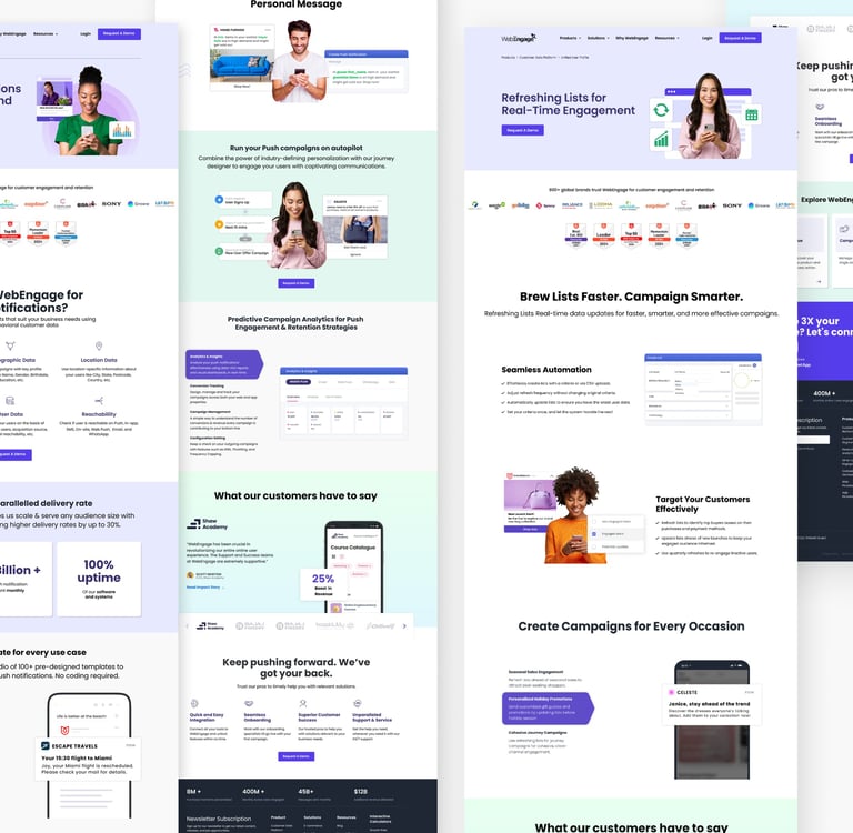
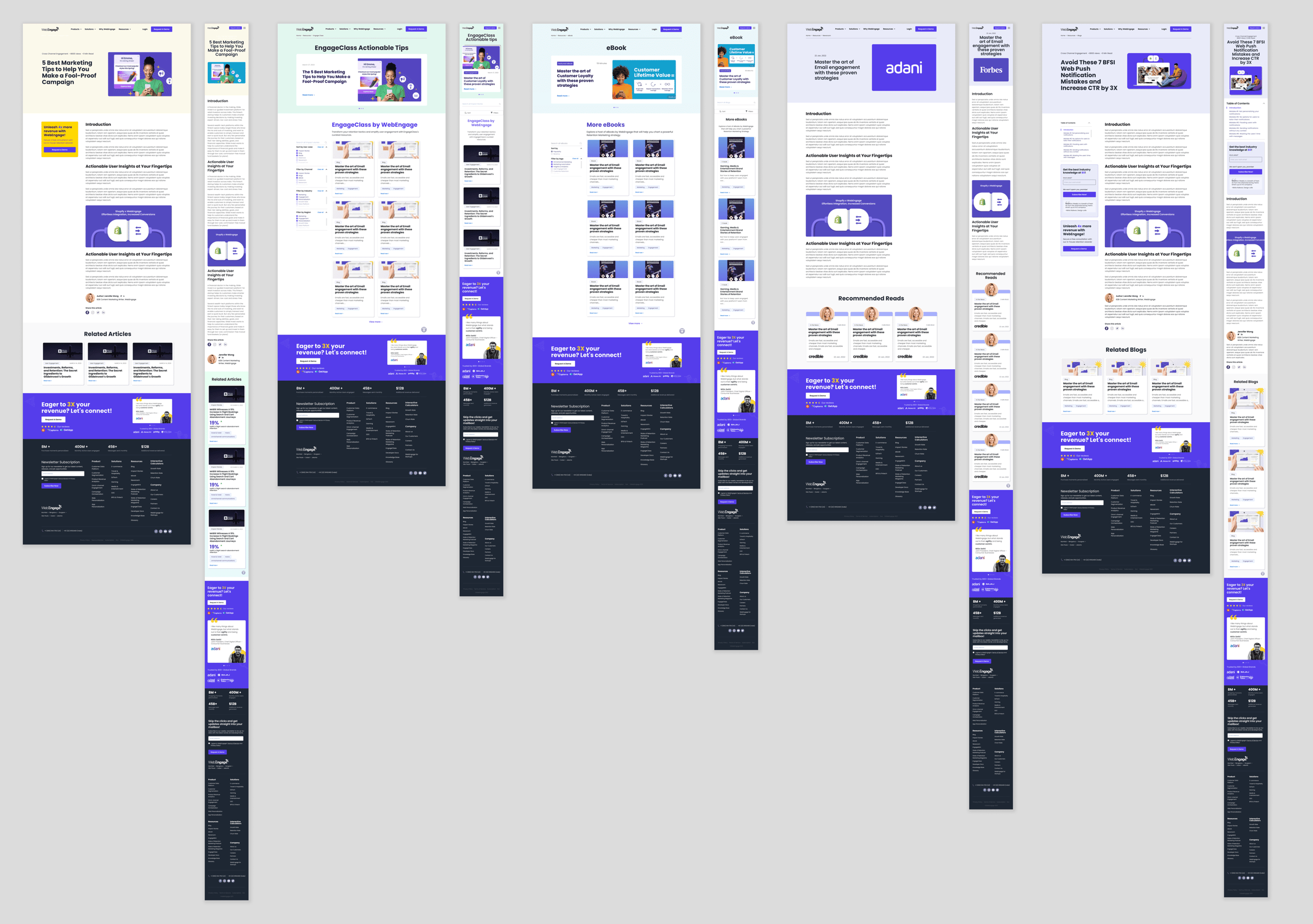
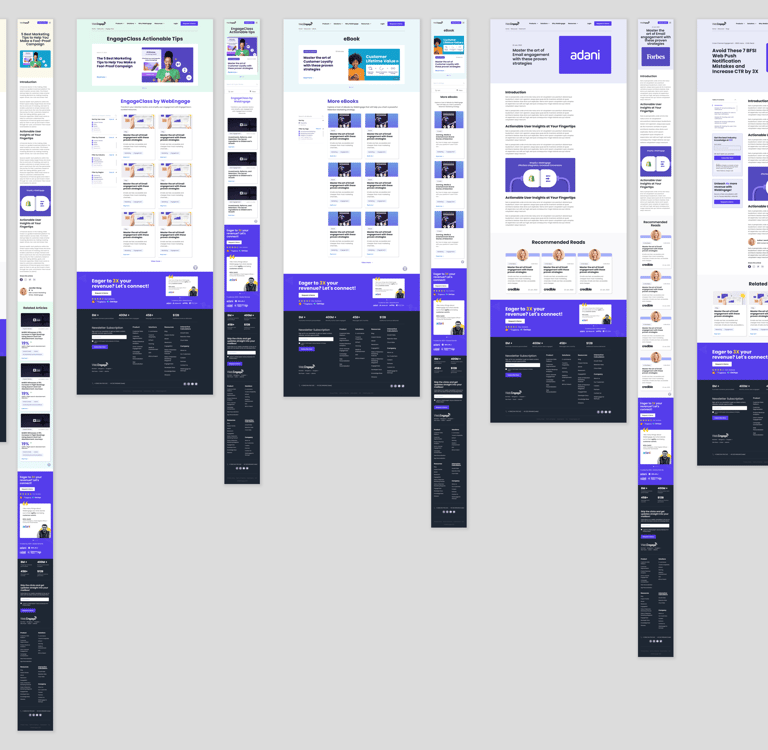
Worked on extending several graphics for marketing landing pages & developed a component library.
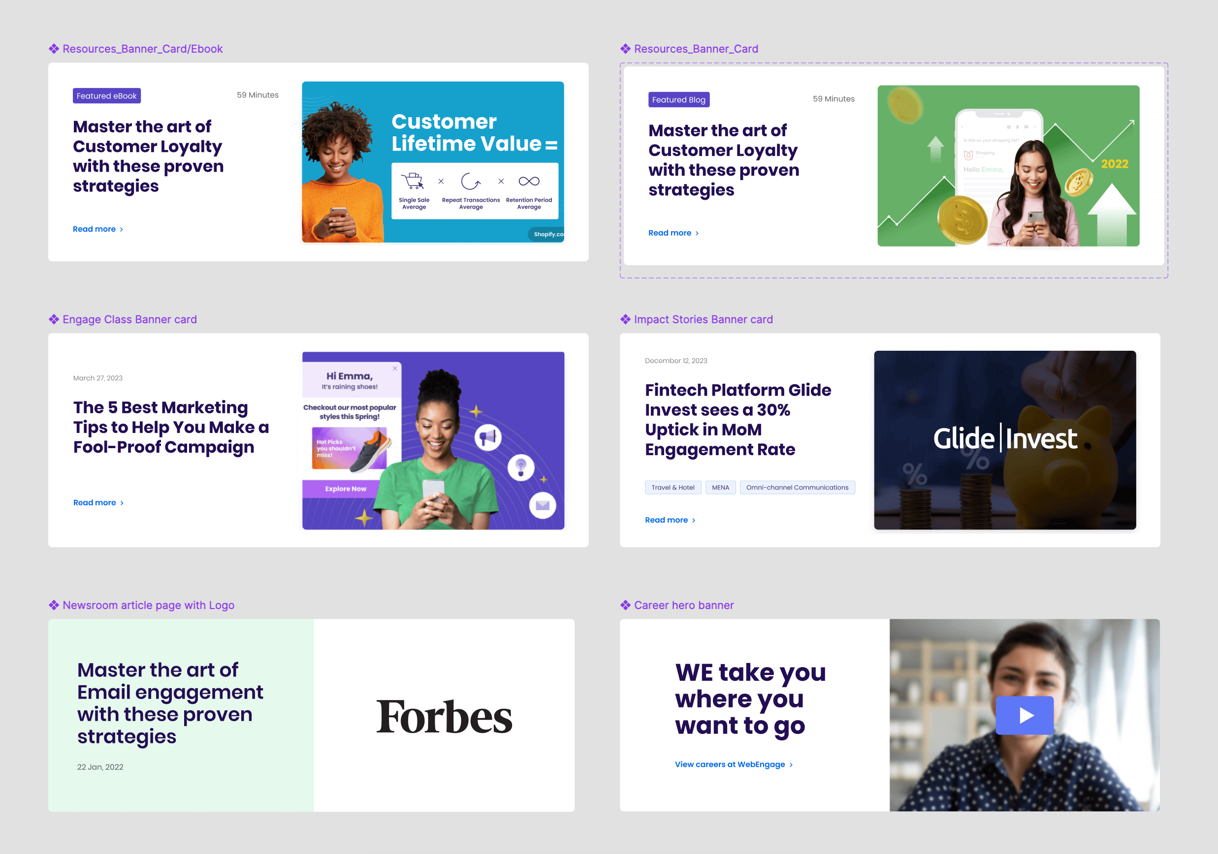
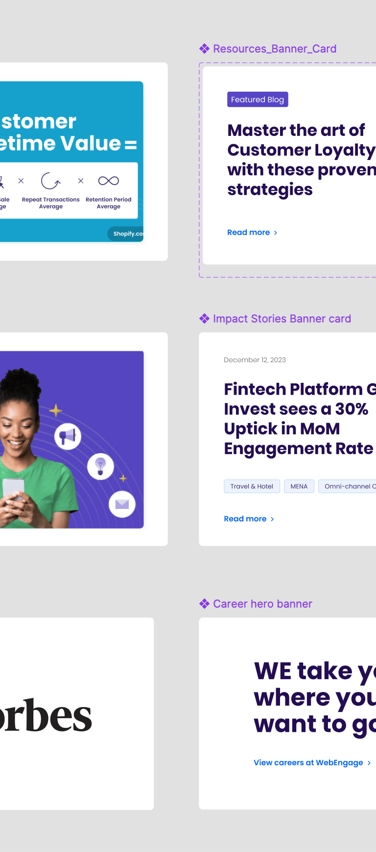
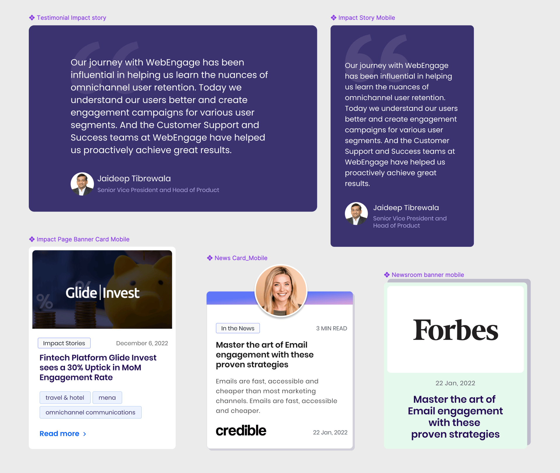
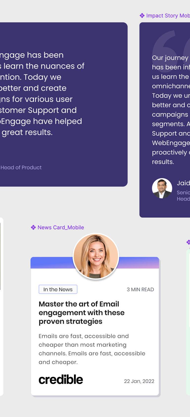
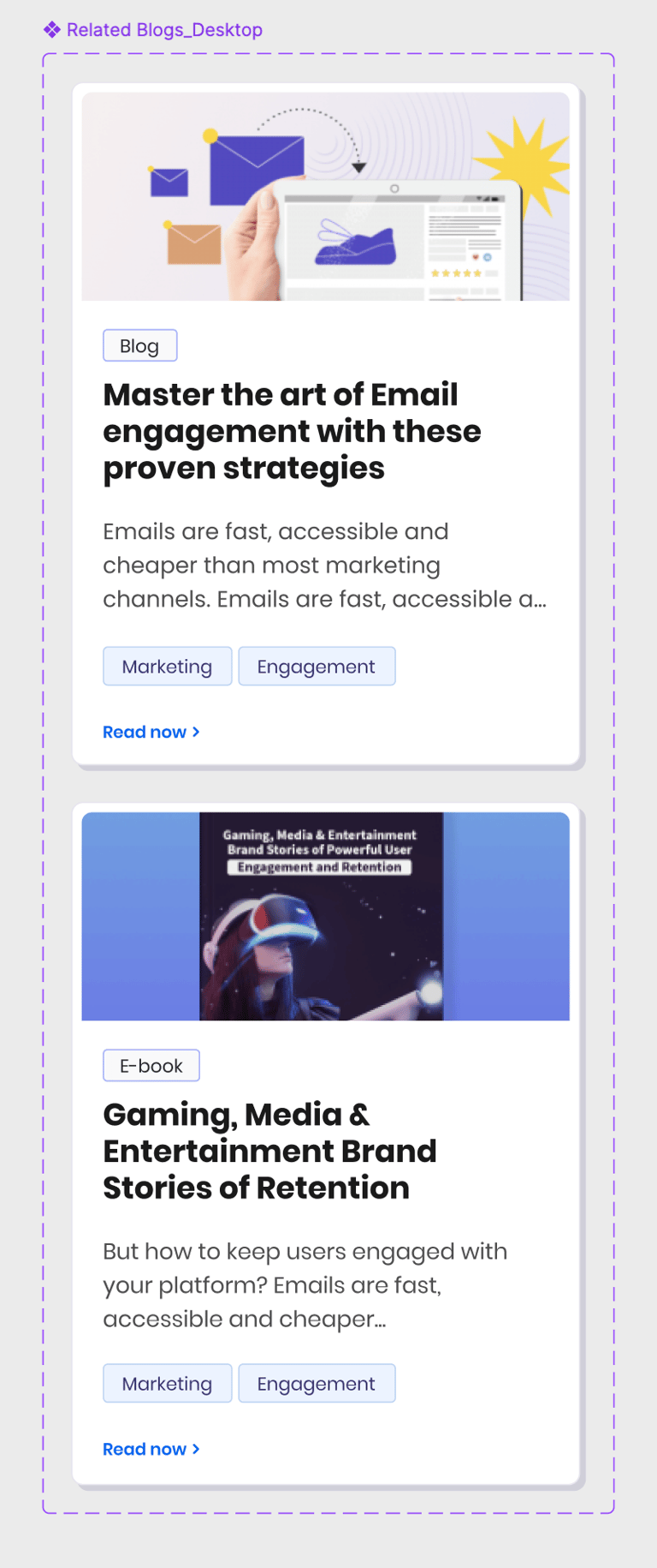
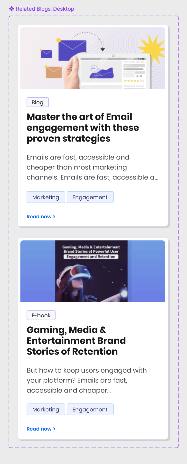
This website was crafted to deliver a seamless and user-friendly experience, featuring a strategic structure designed to build trust and maximize conversions. Clients can effortlessly explore features, estimate prices, and assess their needs. The site also includes compelling trust signals such as video testimonials, before-and-after photos, KPIs, and warranties.
Impact
1. 30%+ Increase in Engagement via Marketing Graphics
Designed promotional graphics, email banners, case studies, and blog visuals that contributed to a 30% MoM increase in user engagement across LinkedIn and email marketing channels. Case studies like Glide Invest saw 30% uplift in engagement rate post-publication—driven by narrative-led design and modular layout systems.
2. Campaign Pages That Convert
Created scalable layouts and visual systems for landing pages and EngageClass content hubs.
These pages contributed to:
2× increase in time-on-page
25–35% uplift in lead magnet downloads (eBooks, webinars, etc.)
Improved readability and faster content discovery across devices.
3. Accelerated Design Ops
Built and maintained reusable visual components for banners, resource cards, testimonial blocks, and blog assets—leading to a 40% reduction in design turnaround time and improved consistency across multi-team use cases.
4. Enhanced Brand Credibility
Designed high-impact visuals featured in media partnerships (e.g., Forbes banners), increasing perceived brand authority and social proof.
Enabled seamless brand storytelling across formats: from eBooks and newsroom hero images to carousel cards and event callouts.
5. SEO & UX Outcomes
Contributed to the redesign of several marketing and solution pages that saw:
Lower bounce rates (~-15%)
Higher scroll depth
Better mobile responsiveness and accessibility
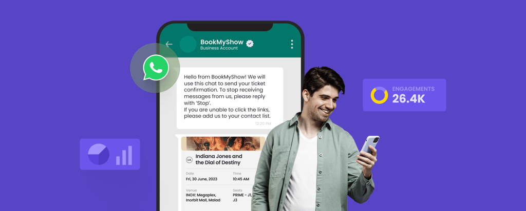
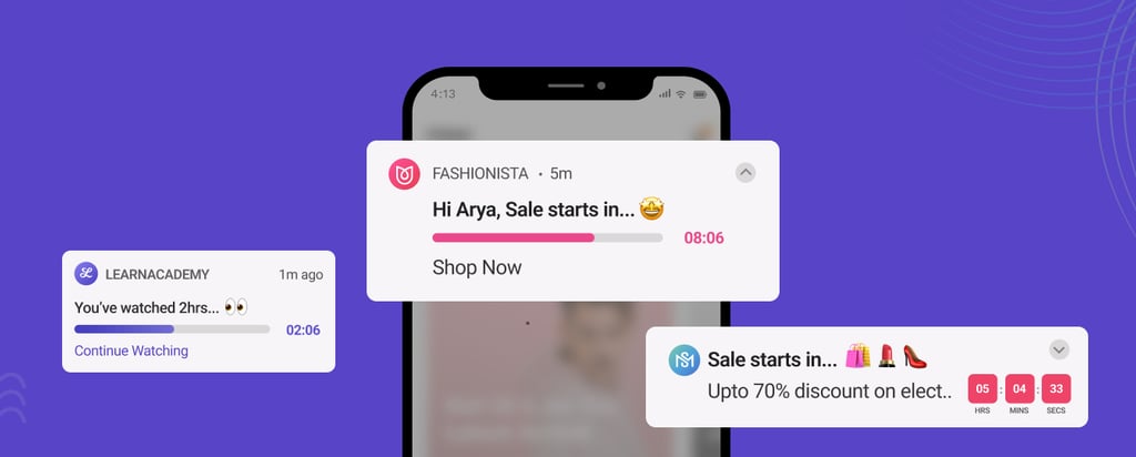
Blog Images

B
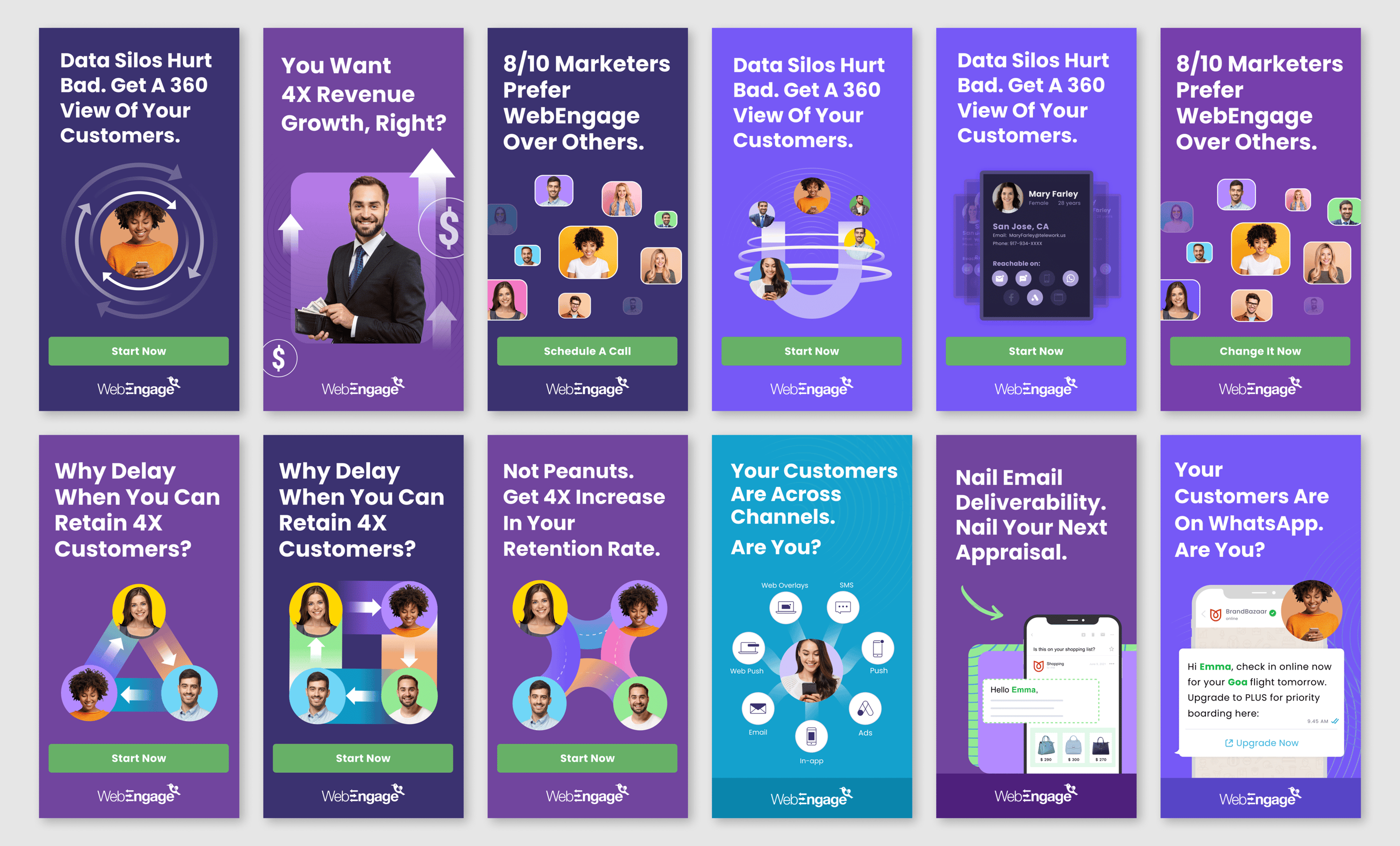
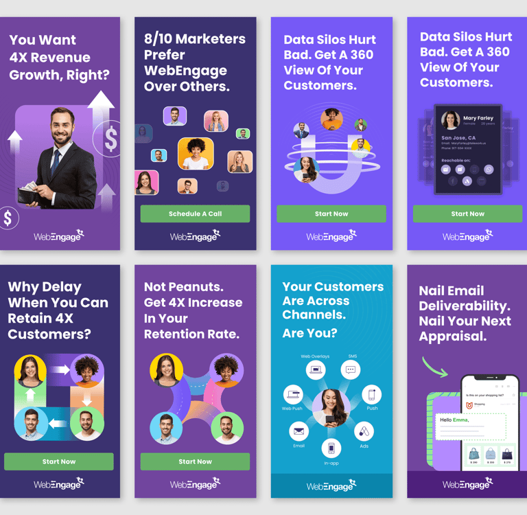
Marketing Ads (TOFU,BOFU)
WebEngage used these visually consistent and message-driven ads to promote itself as a leading customer retention and engagement platform which increased CTR by 2x.
Here's how these ads worked strategically to drive brand awareness, trust, and conversions:
Solving real user problems
Highlighting quantifiable/measurable results
Building trust with social proof
Making the next step easy
Reinforcing brand identity visually
This positioned WebEngage not just as a tool, but as an essential partner in growth and retention.
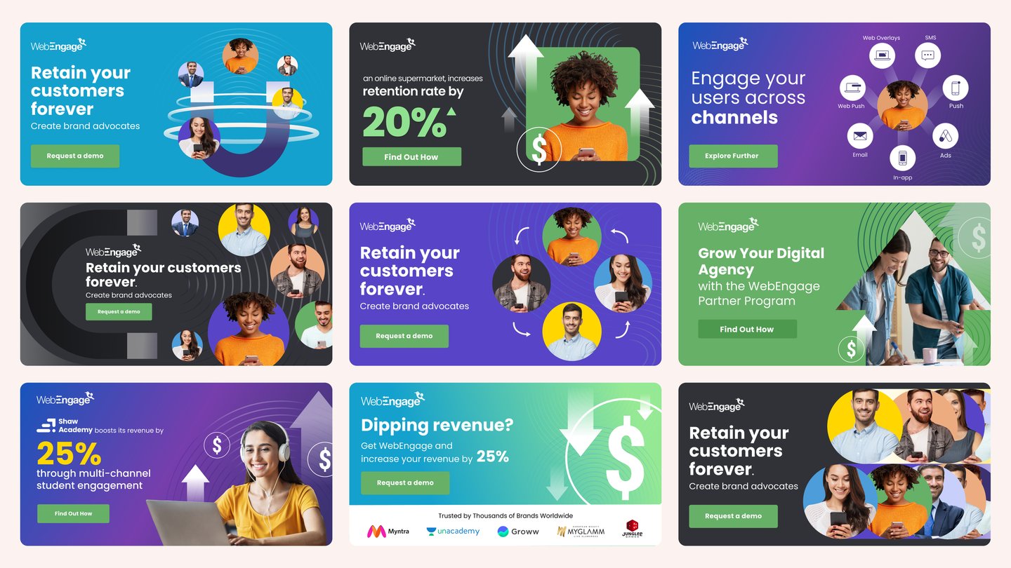
Another set of ads by WebEngage were part of a targeted, retention-focused marketing campaign aimed at converting businesses into platform users by highlighting strong, customer-centric value propositions.
Here's a breakdown of the ad strategy:
Retention and ROI as their north star metric
Trust-building through quantifiable case studies
Inclusive, scalable appeal for brands and agencies
Clear, consistent CTAs to drive demo requests and conversions
Lastly, the ads built trust and urgency, with a 2X CTR.
LinkedIn Ads
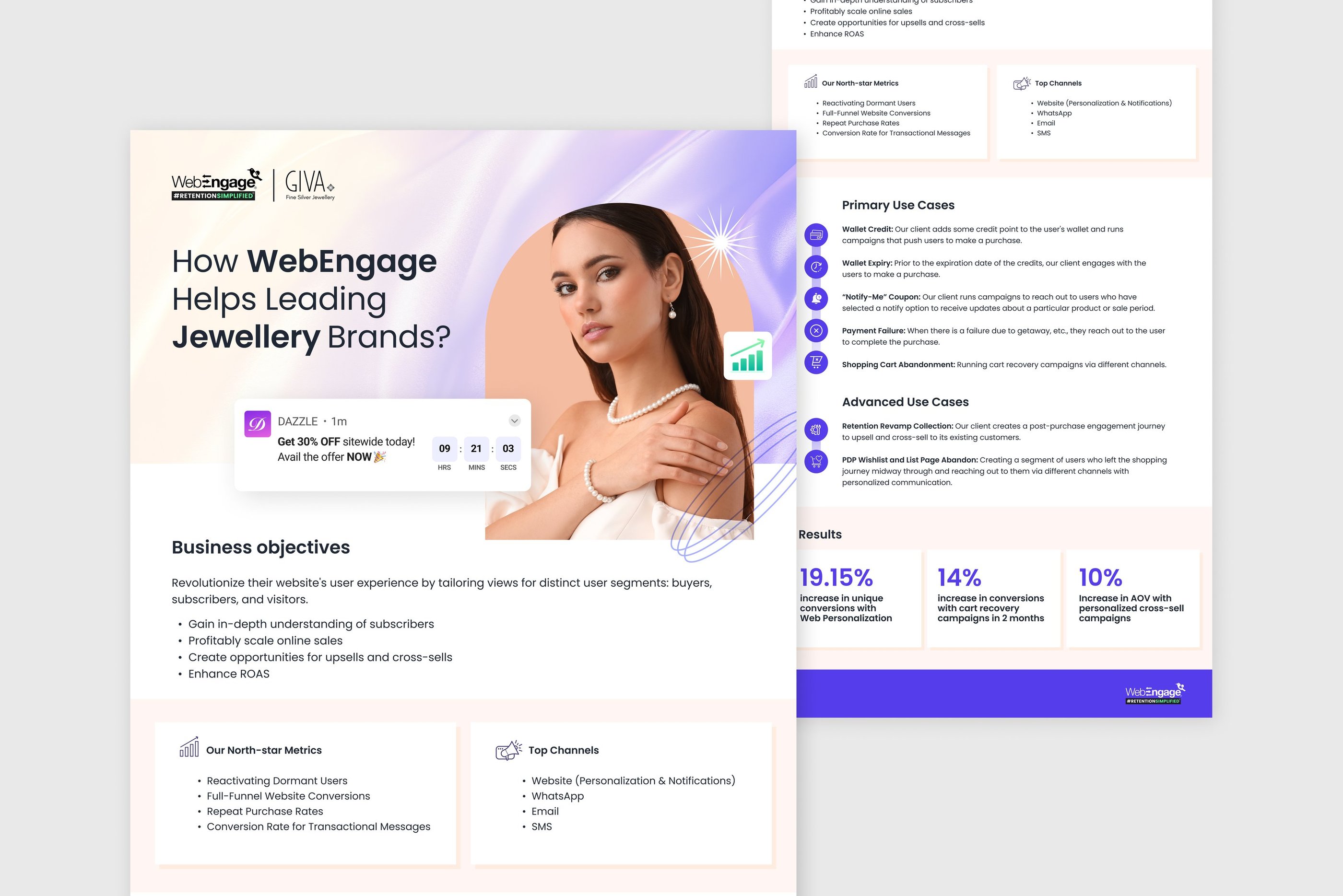
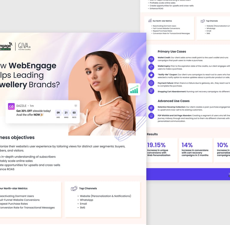
One Pagers for Pitches
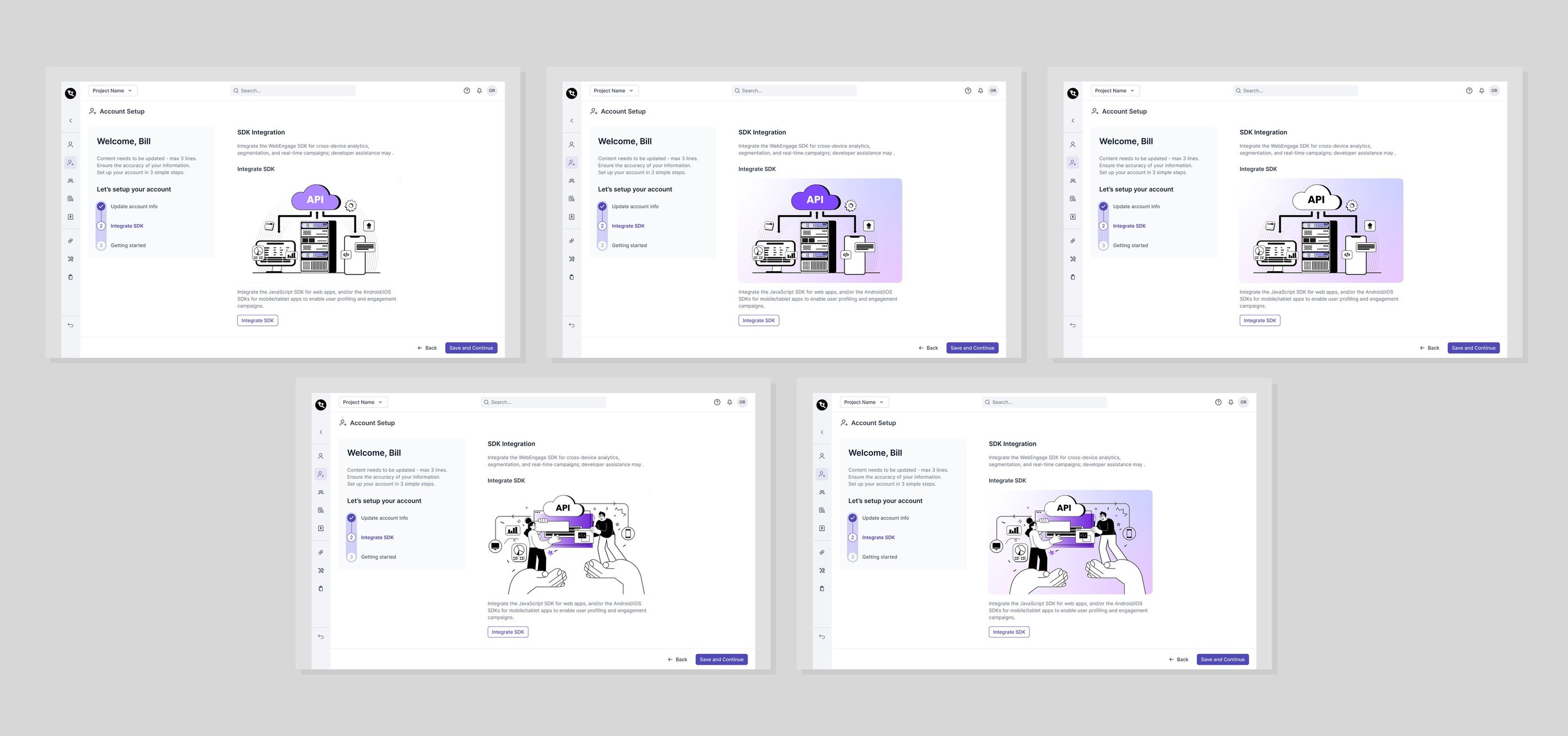
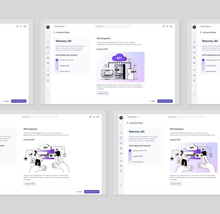
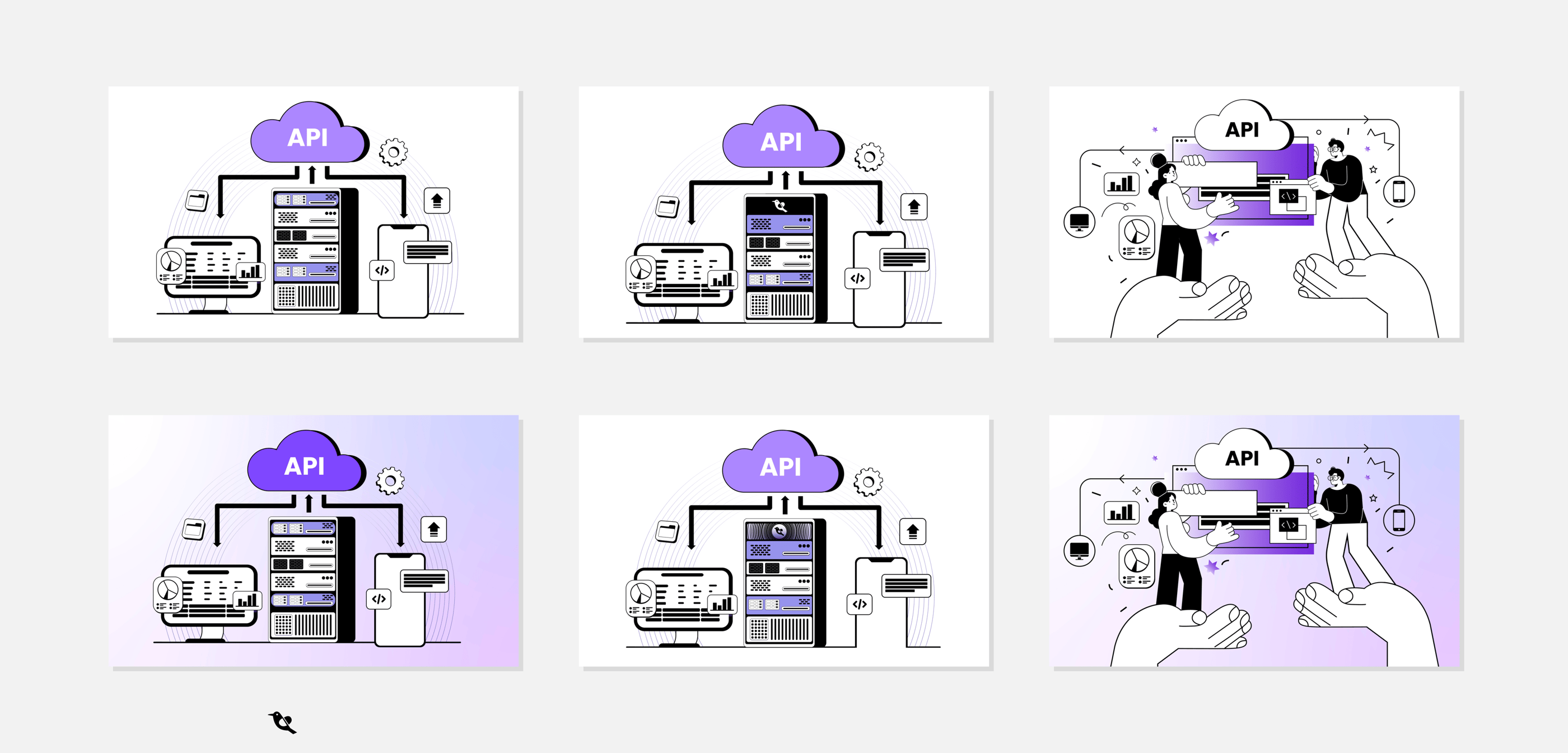
Dashboard Illustrations
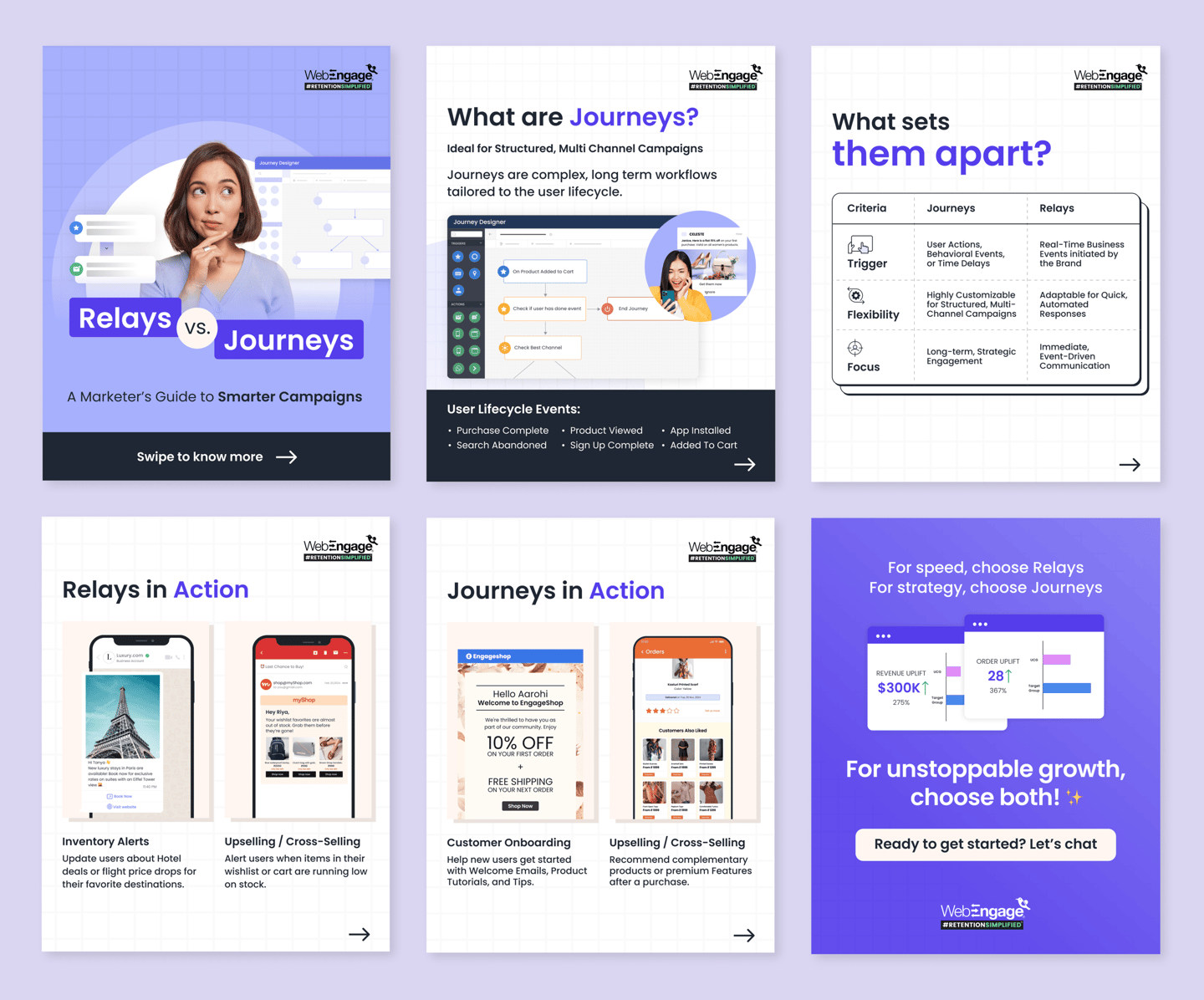
Social Media
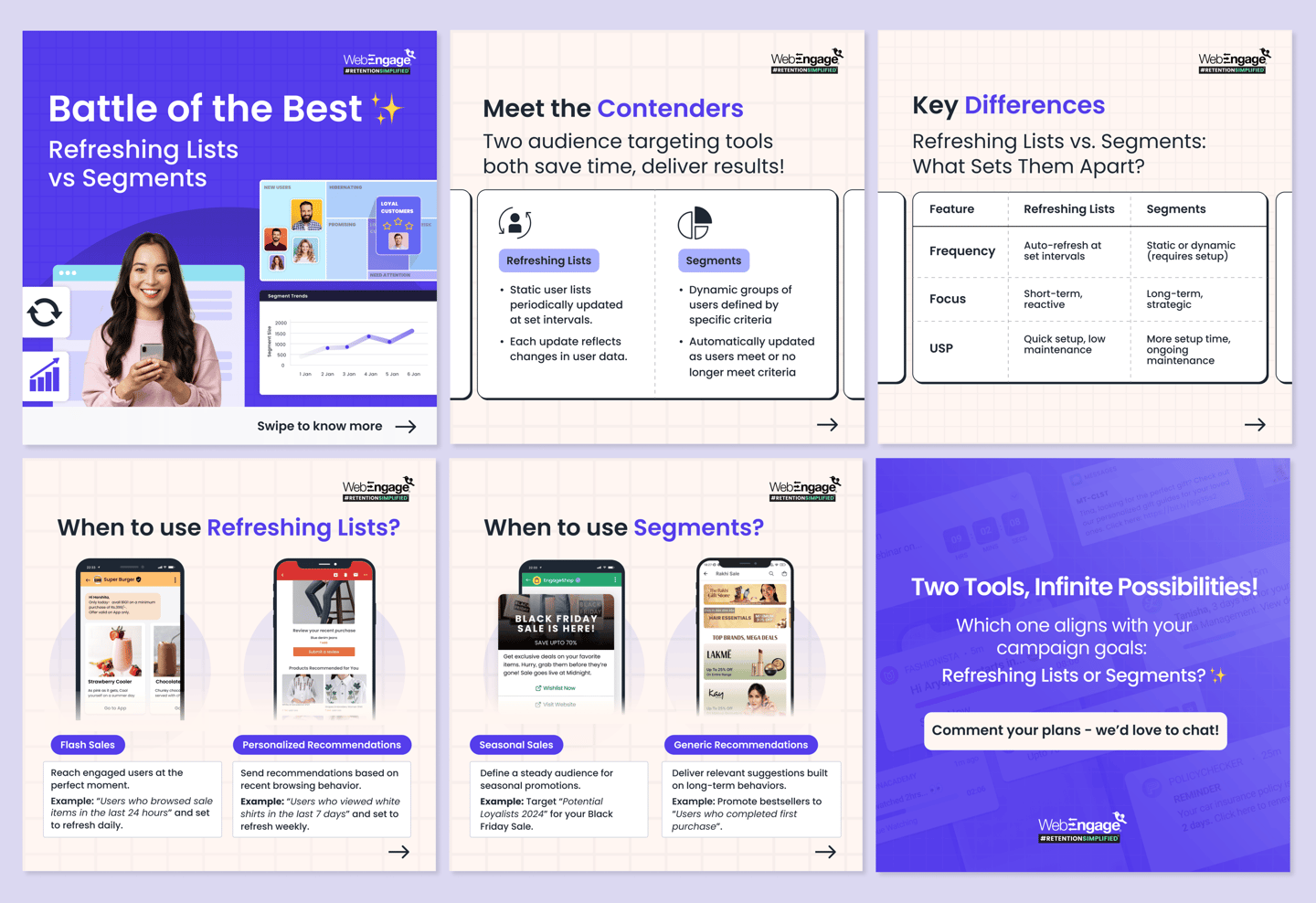
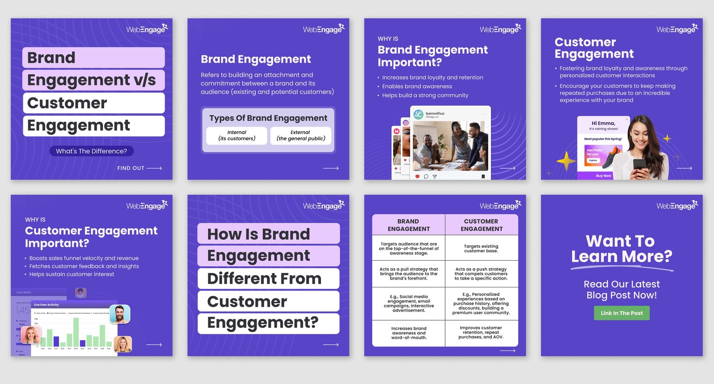
Sales Presentations
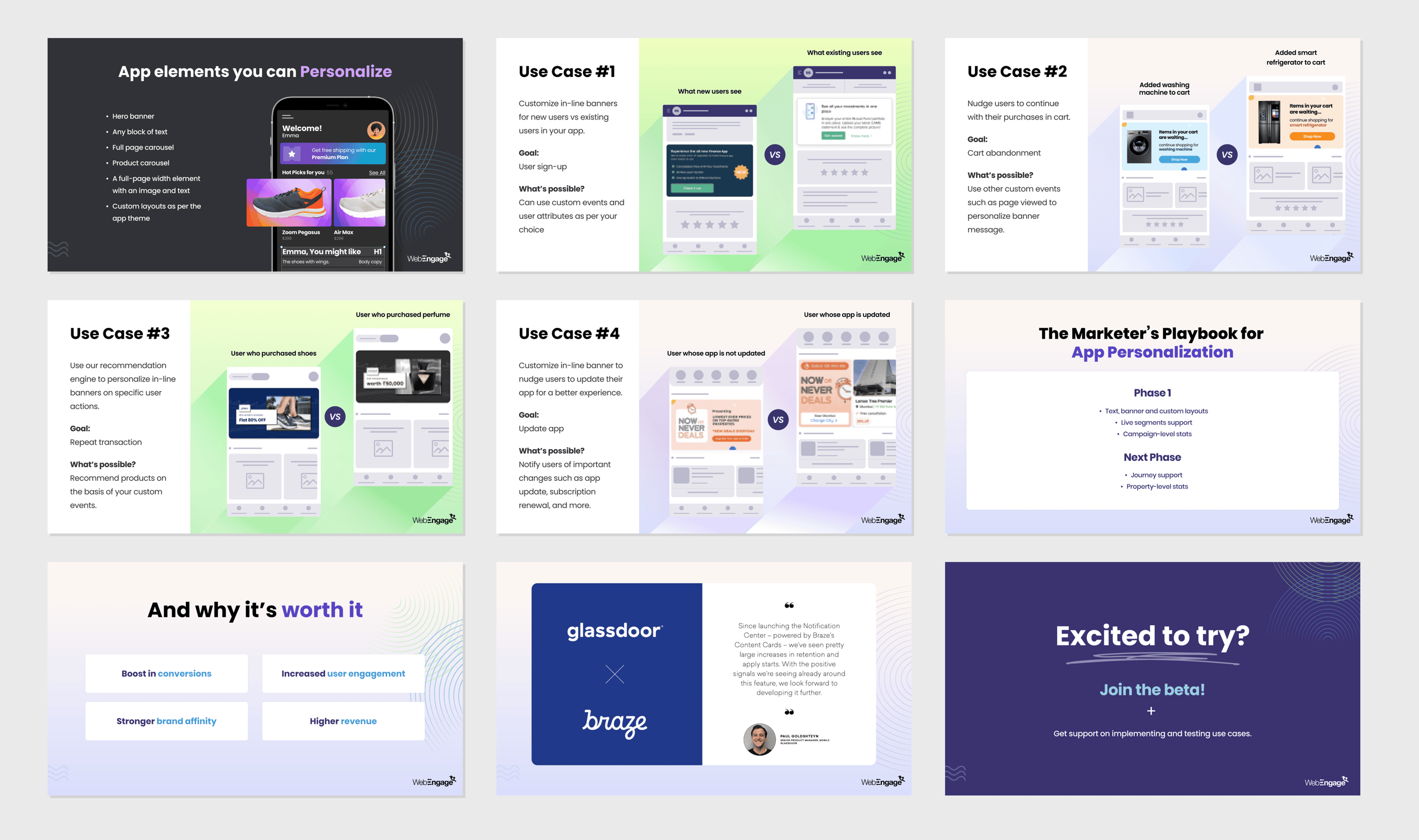
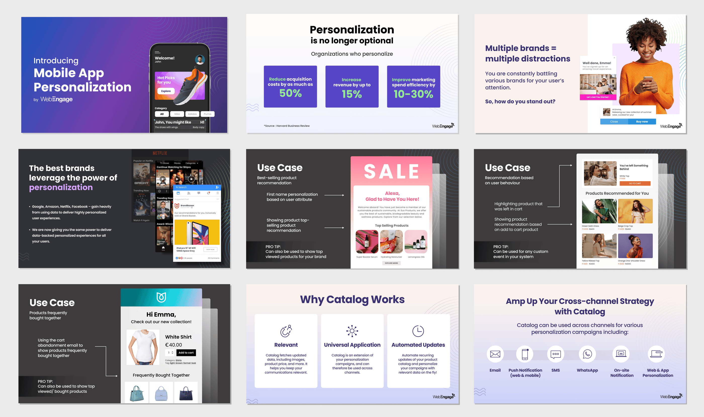
For this project, I designed a comprehensive presentation showcasing WebEngage’s key platform capabilities—specifically focused on mobile app personalization, cross-channel engagement, and customer retention.
These decks were built to visually communicate the power of personalized customer engagement through WebEngage’s platform. My goal was to simplify complex product features and showcase their real-world impact using use-case slides, customer journeys, and UI-focused storytelling.
Objective:
To communicate the value of personalization and automation in driving revenue growth and retention, while maintaining a high level of design clarity, brand consistency, and business relevance.
My Contributions:
Visual Strategy & Storytelling: Translated complex SaaS features into visually digestible, benefit-driven slides tailored for marketing and product stakeholders.
Brand-Consistent Design: Applied WebEngage’s brand colors, gradients, icon styles, and typography to build a cohesive visual system.
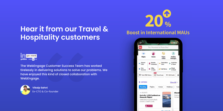
Data-Driven Visual Hierarchy: Highlighted key stats and business results (e.g., “+25% Revenue”) to drive home product impact.
Conversion-Focused UI Mockups: Integrated real interface examples (mobile app, product recommendations, emails) to ground the narrative in use cases.
Interactive Tone: Used conversational CTAs, tips, and dynamic layouts to keep viewers engaged without overwhelming them.
Outcome:
The presentation became a valuable asset for WebEngage’s sales and marketing teams—used to pitch personalization capabilities to potential partners and enterprise clients. It reflects my ability to merge design thinking with business objectives and product clarity.

