Foodhall, a premium lifestyle food superstore, is a pure gastronomical delight. Latching on to the love for global cuisines, Foodhall is an answer to every foodie’s inner epicure. It is a one-stop destination for a well travelled urban consumer who understands the nuances of gourmet cooking. An eye-appealing exotic store captures the novel concepts from around the world on one platter. With an aesthetic mix of Indian flavours with the west, this specialty store is a den for discovering the finest global foods and ingredients.
FoodHall:
The Premium Gastronomical Delight
SERVICES PROVIDED
IDENTITY
BRANDING
MARKETING GRAPHICS
Design Brief
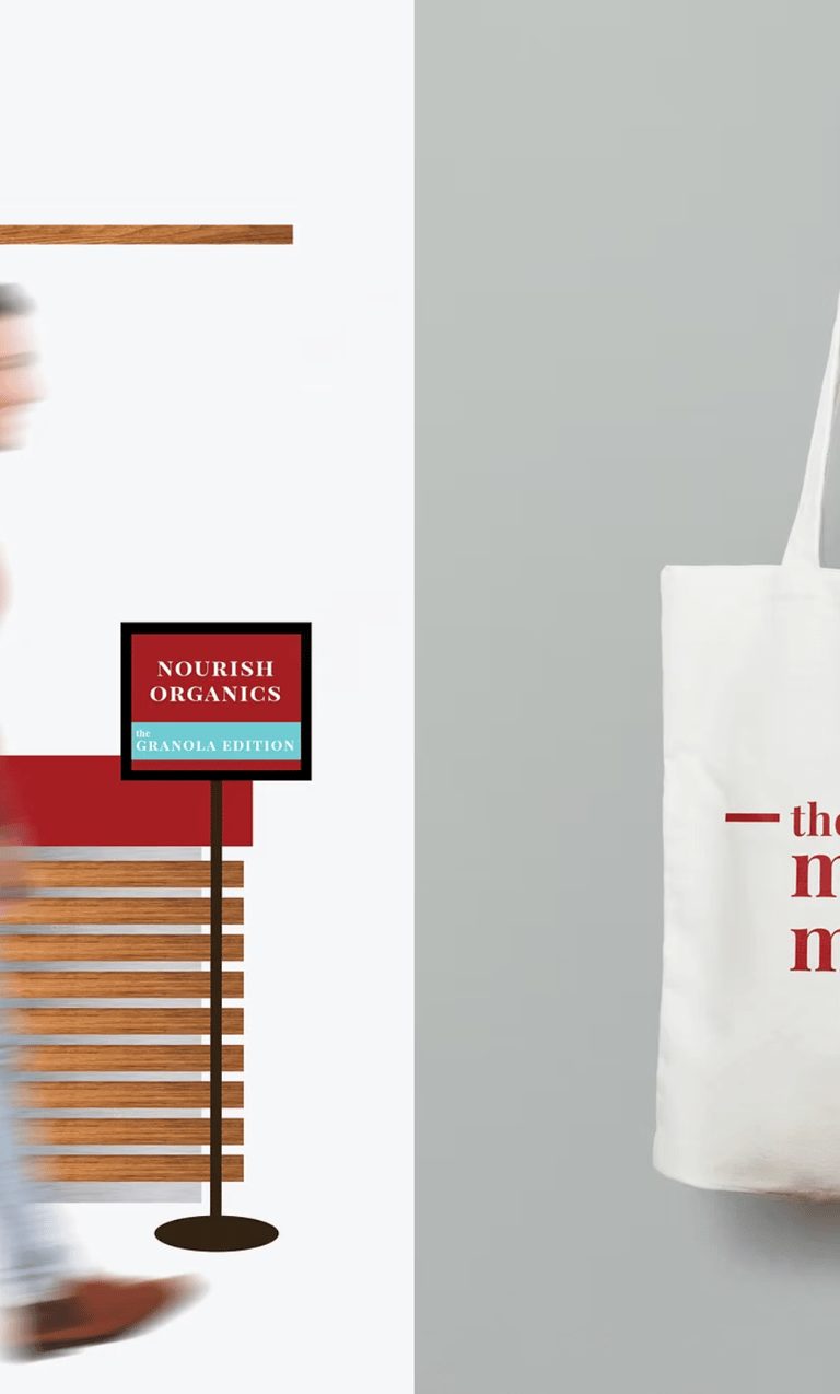
The brief was to brand a platform for upcoming entrepreneurs to showcase their products. For this, an event called 'The Maker's Market' was designed to help budding indigenous brands become more popular.
Design Direction
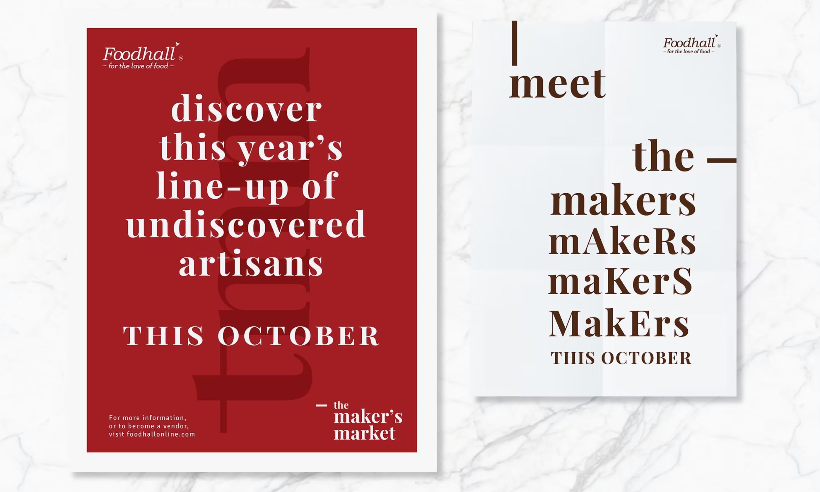
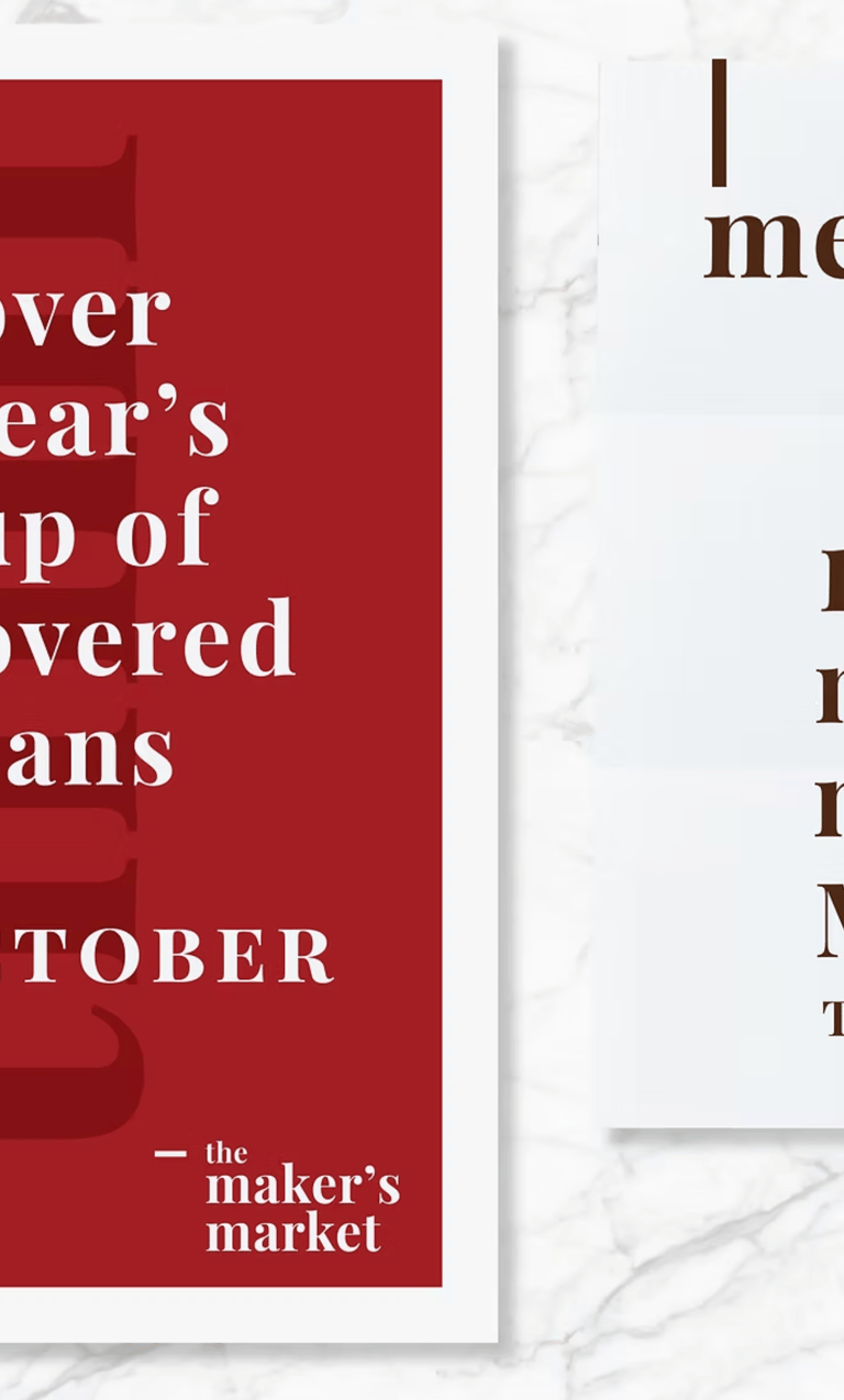
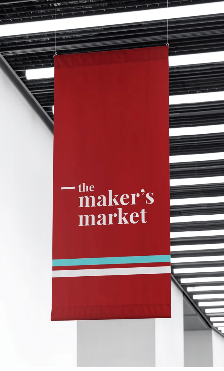
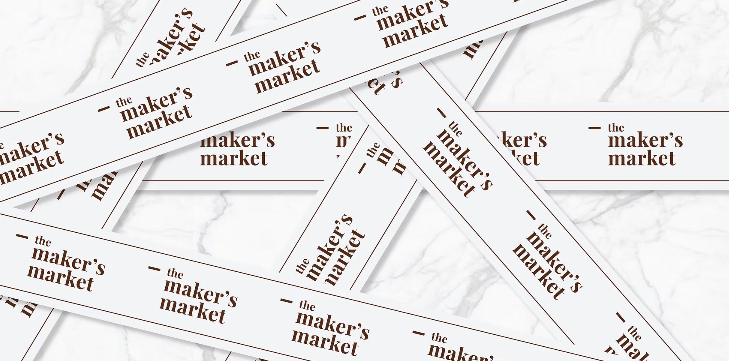
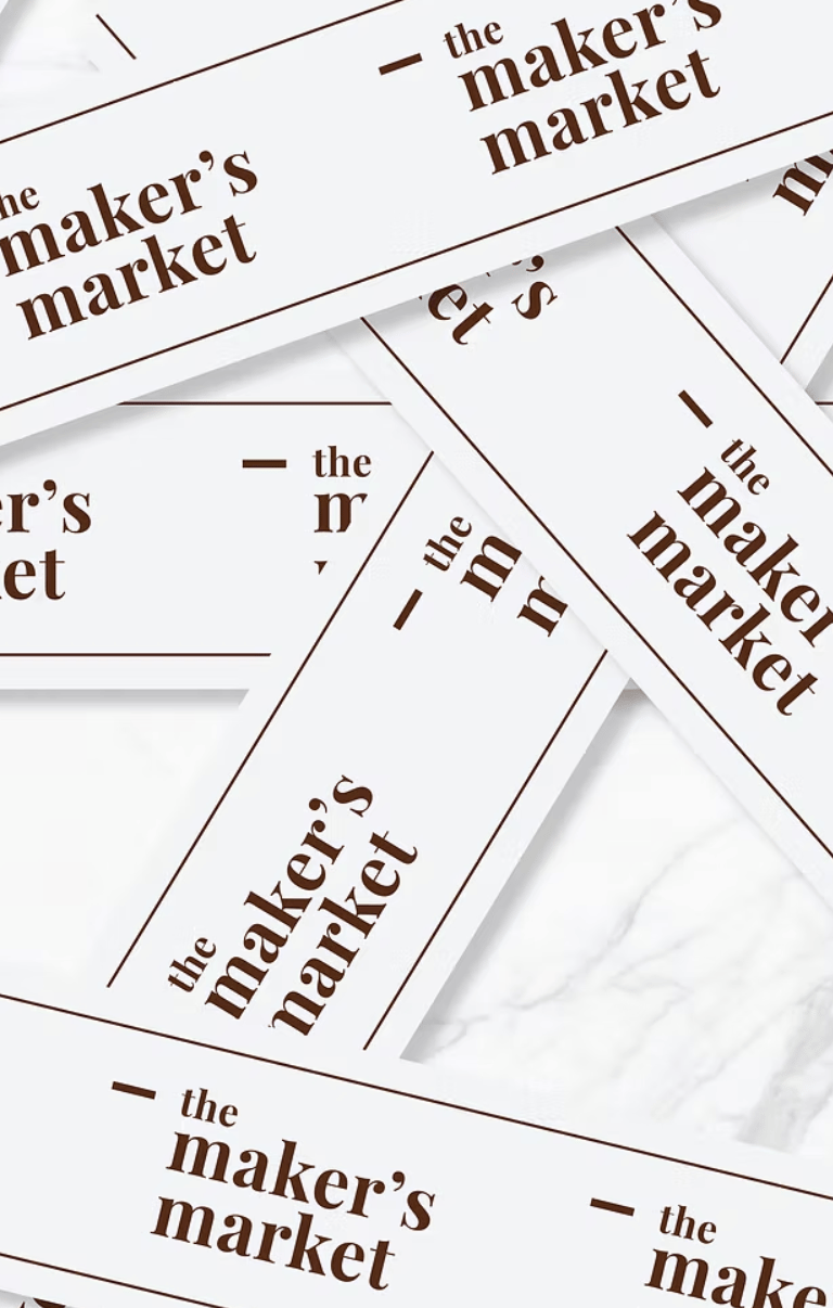
The idea was to brand 'The Maker's Market' as a link or node; a platform from the entrepreneur to the consumer. The restrictions were to use the brand fonts and colours and yet create a distinct identity. A bold version of Playfair was used for typography with passionate colours. Several collaterals were created for this event.


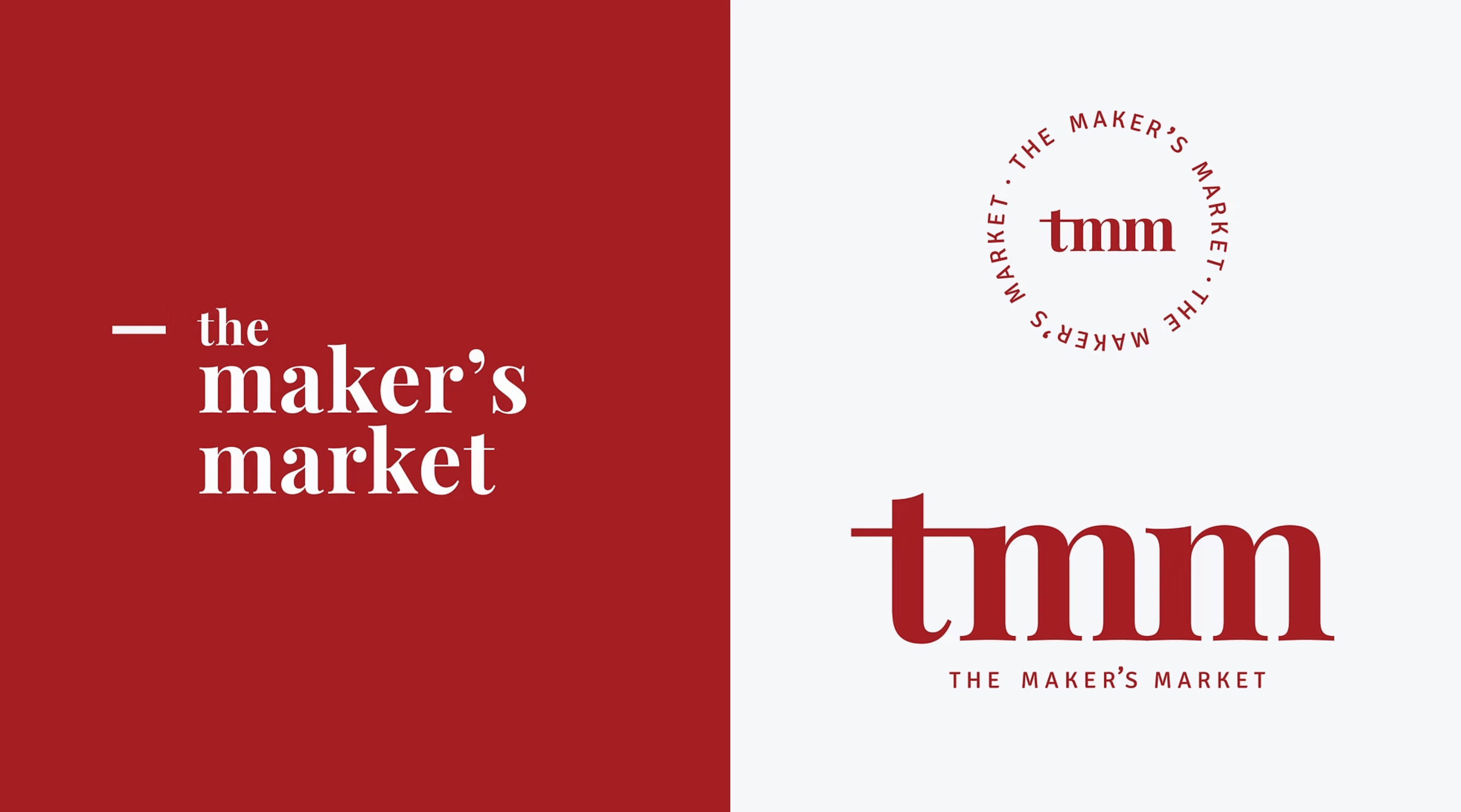
The Makers Market

The Identity
At its core, The Maker’s Market was conceived as a connecting platform — a symbolic node between passionate entrepreneurs and discerning consumers. The aim was to go beyond a transactional market and instead build a branded experience that champions authenticity, craft, and connection. This connection is made tangible through a refined, editorial design language that balances warmth with sophistication.
The primary logotype uses a bold, stylized rendition of Playfair Display, emphasizing editorial seriousness and timelessness. The serif conveys a sense of craftsmanship and heritage, aligning with the artisanal nature of the vendors. A minimal dash (“—”) precedes the logotype, acting as a typographic device to reinforce the market as a directional link — from maker → market → consumer.
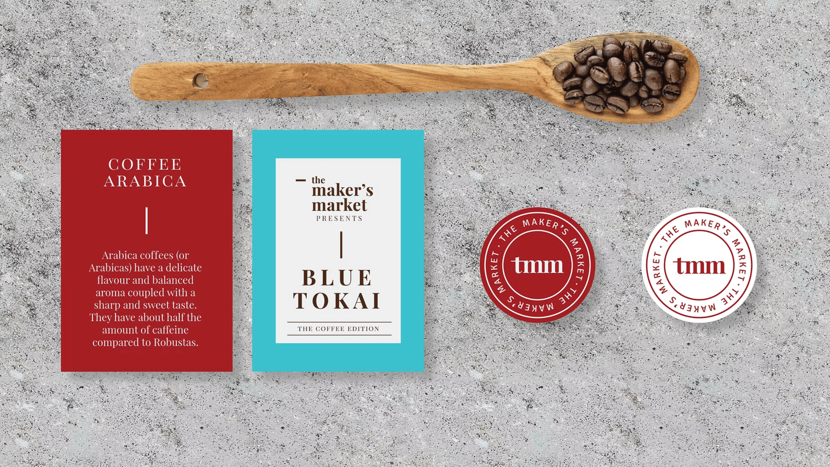
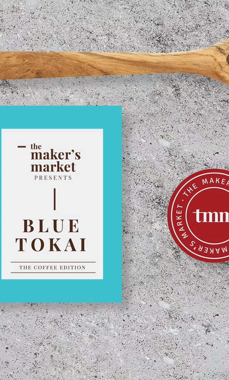
The secondary mark — “tmm” inside a circular stamp — adds flexibility across smaller applications like stickers, tags, and digital avatars. This stamp-style form further communicates market authenticity and handmade quality.
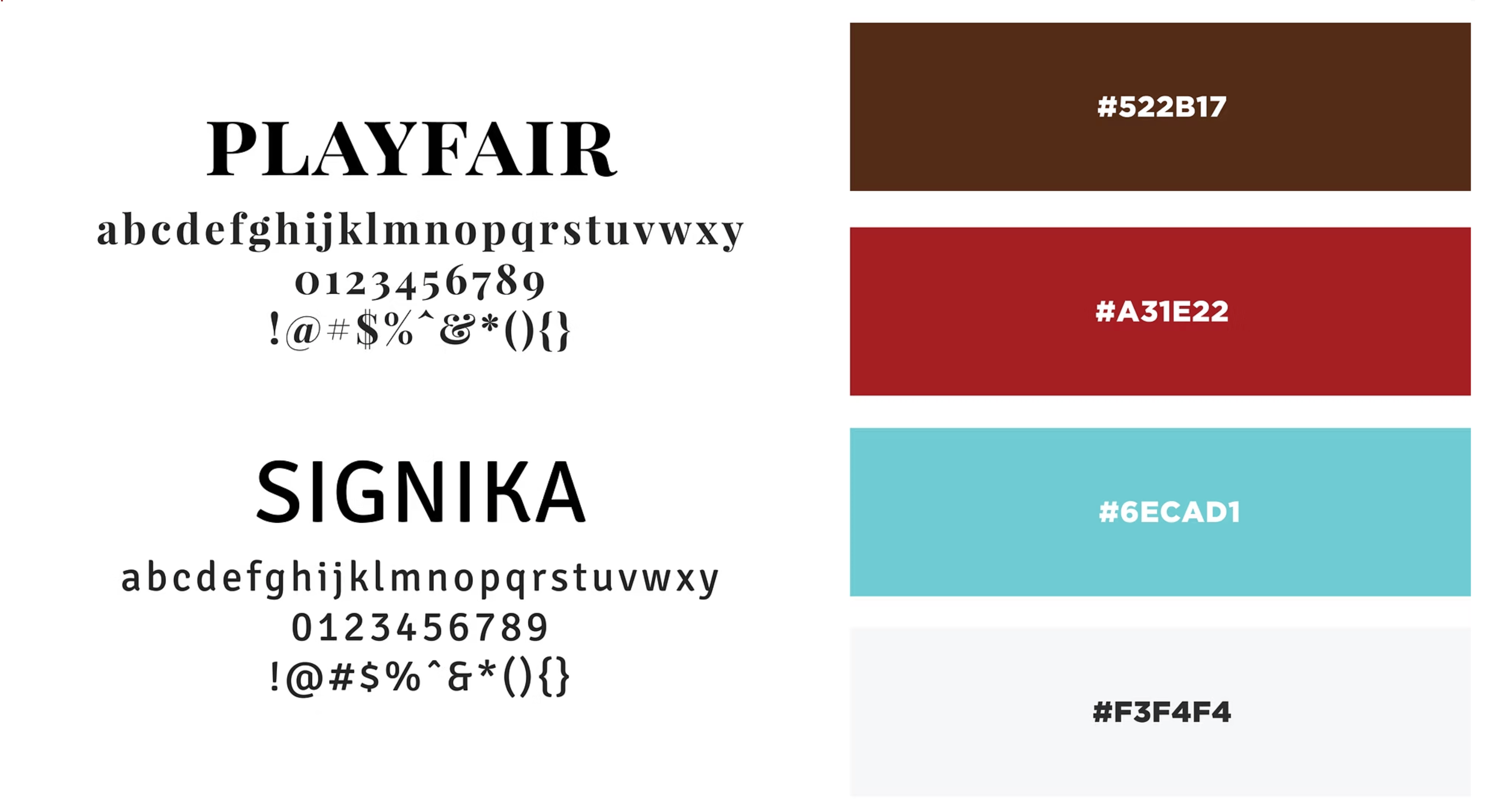
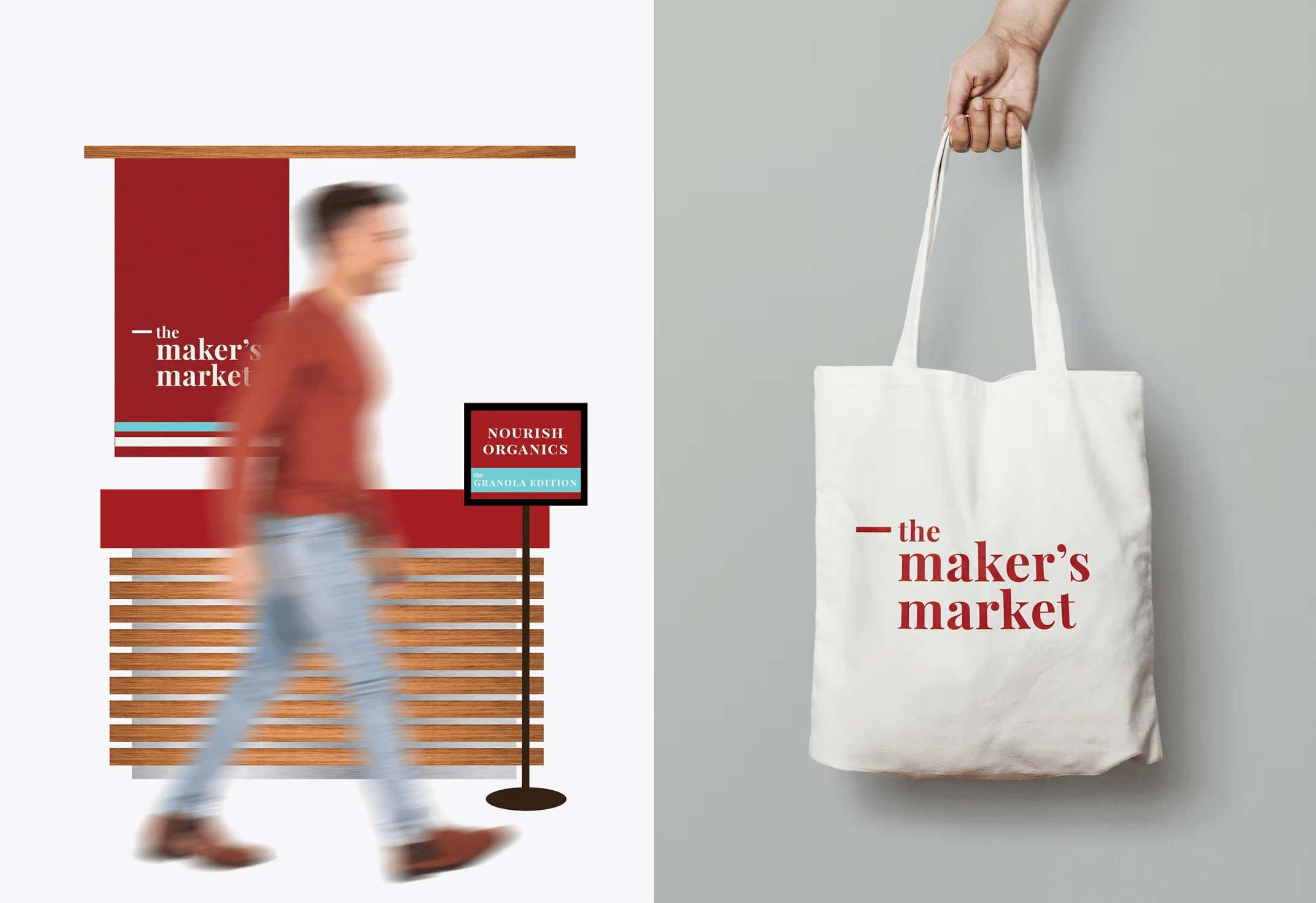
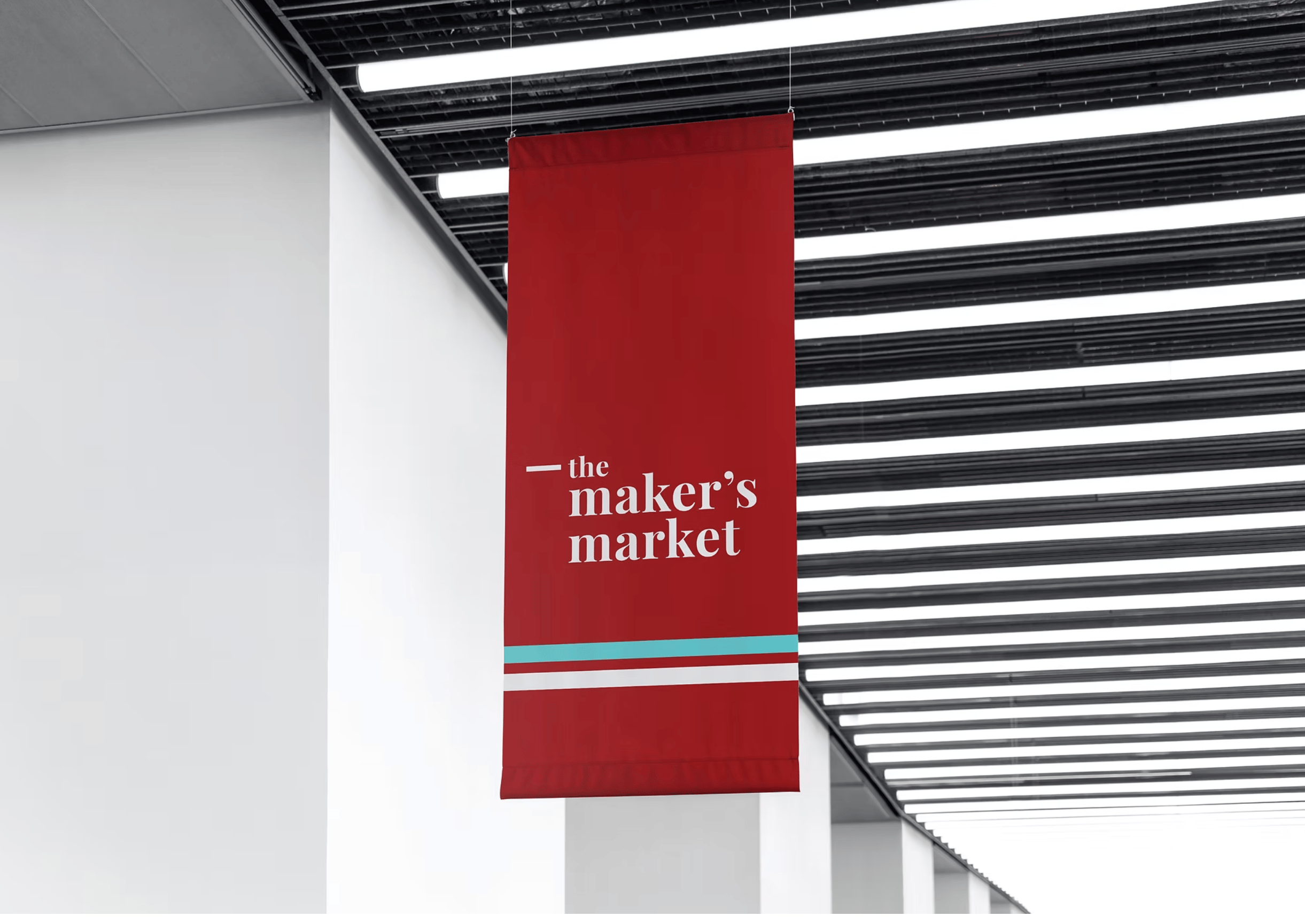
The palette builds emotional resonance using:
Deep Rust Red: Evokes passion, handmade effort, and visual richness.
Warm Brown: References organic materials — wood, spice, soil — grounding the palette.
Bright Teal: Used sparingly to add a fresh, modern lift and differentiate special editions.
Muted Greys & Whites: Provide visual balance and allow text and products to stand out.
This combination helps the brand feel both earthy and contemporary, reflective of the traditional roots and modern aspirations of its makers.
Fonts & Language System
Playfair Display is used for all display and heading text, giving prominence and style.
Signika, a geometric sans serif, contrasts as the body copy typeface, ensuring readability and accessibility.The interplay of classical serif and humanist sans serif mirrors the blend of heritage craft with new-age entrepreneurship.
The interplay of classical serif and humanist sans serif mirrors the blend of heritage craft with new-age entrepreneurship.
Posters & Promotional Assets
The posters strike a balance between minimalism and typographic drama. One uses stacked text and vertical scaling to create intrigue and draw the viewer in. The repetition of the phrase “makers” in varied cases (e.g., “mAkErS”) evokes diversity and individuality — celebrating the plurality of creators under one platform. These assets not only announce the event but also embody the event’s personality — curious, bold, and rooted in design integrity.
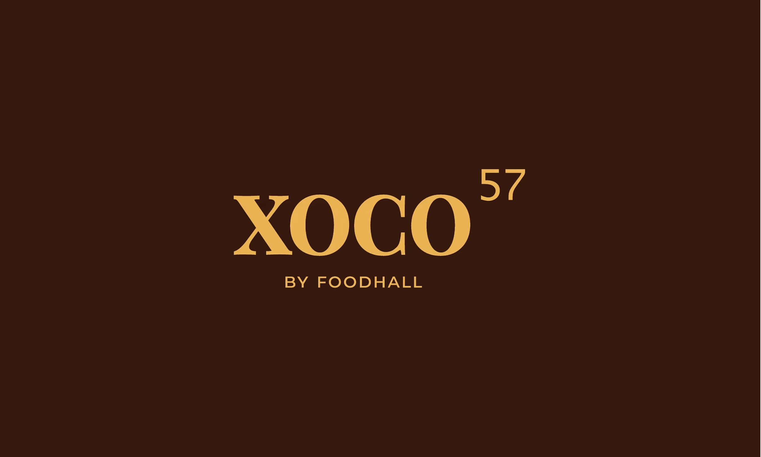
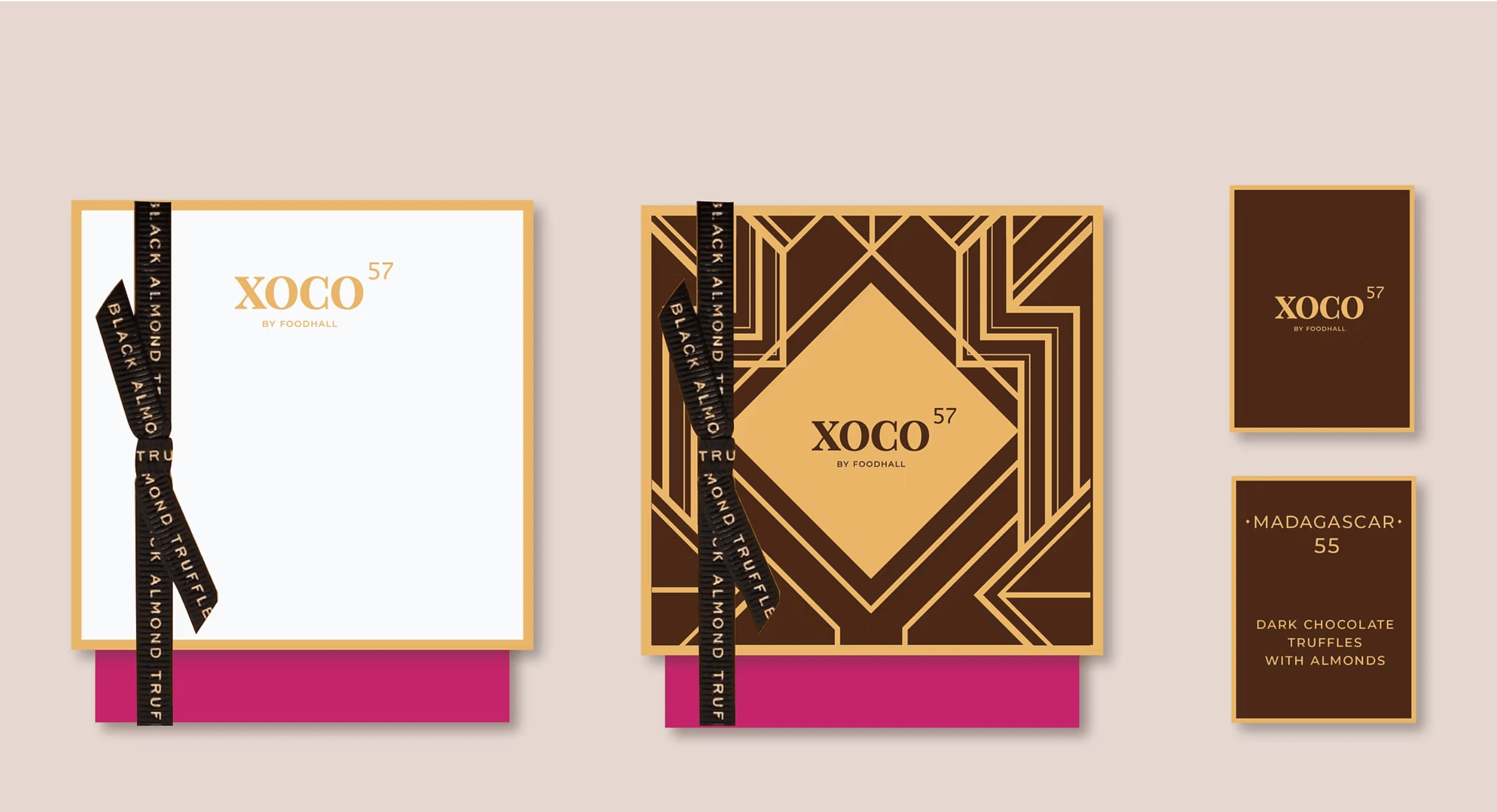
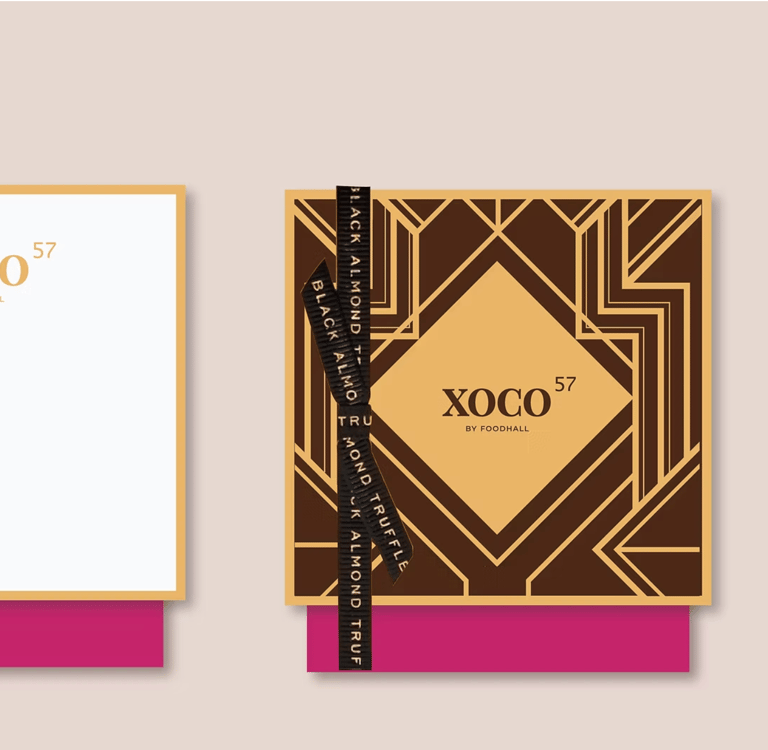
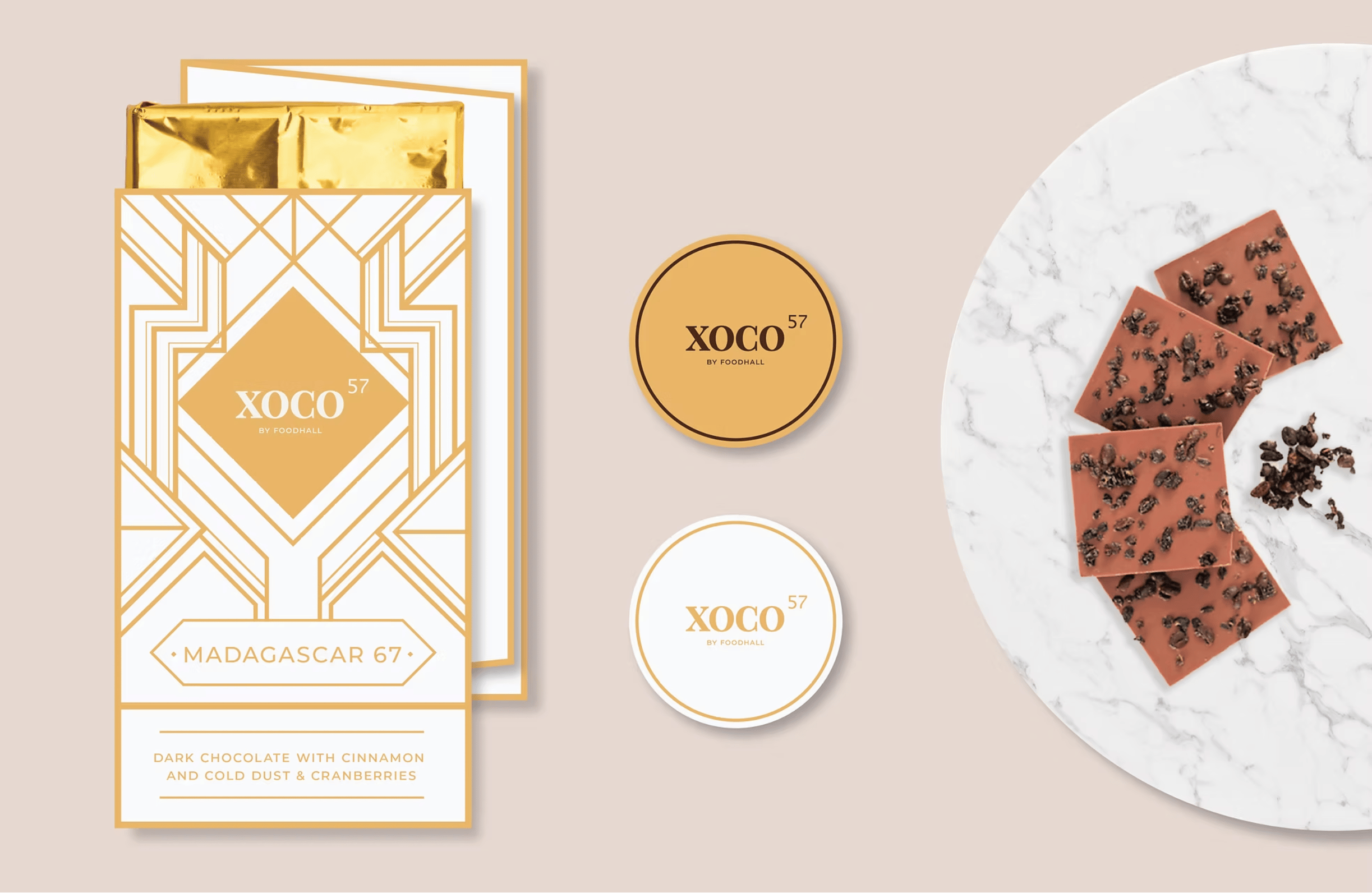
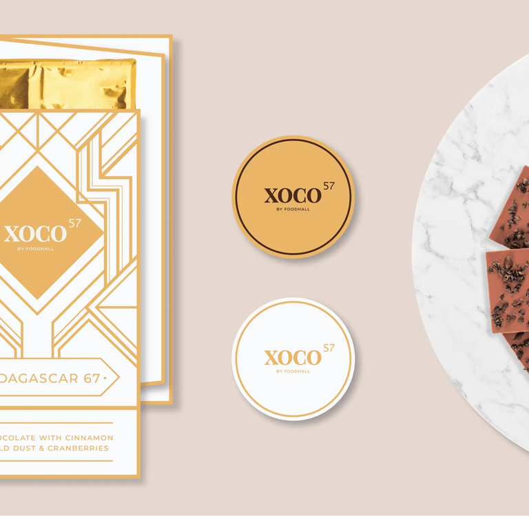
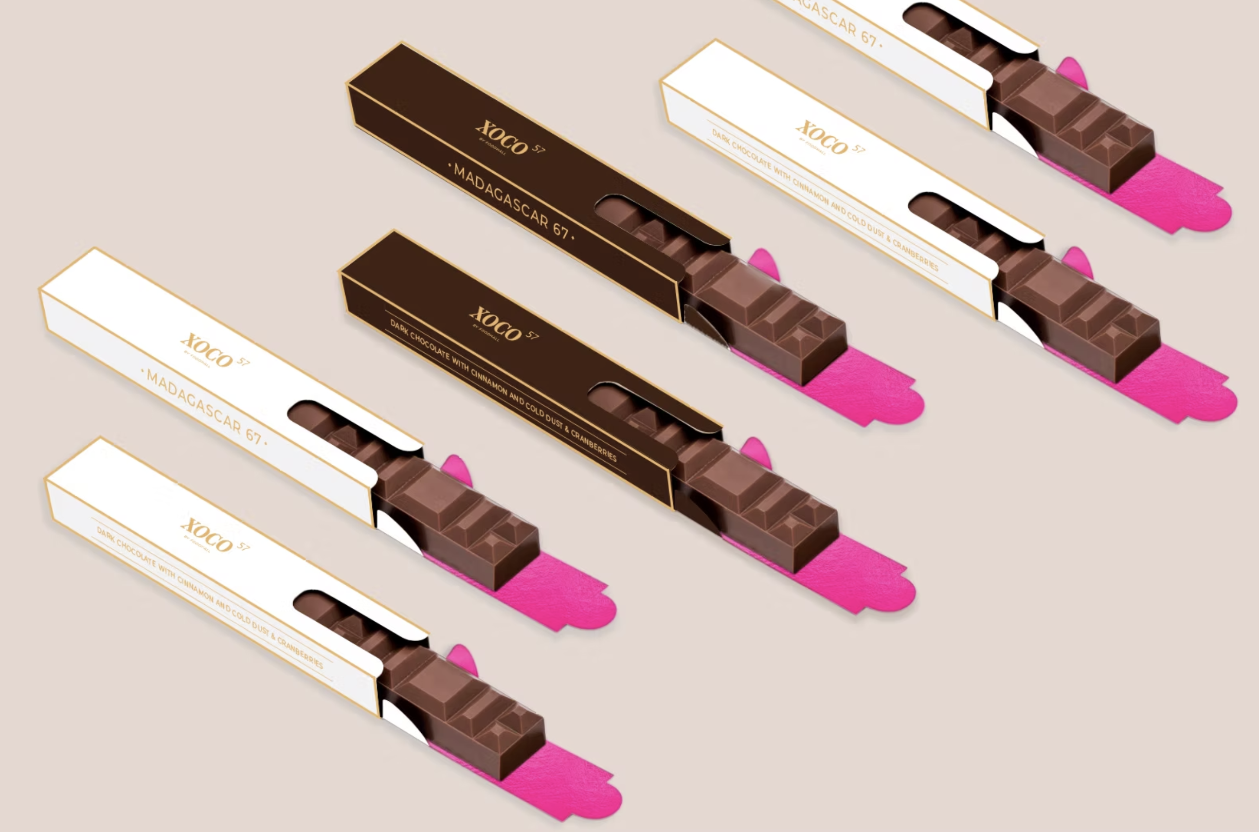
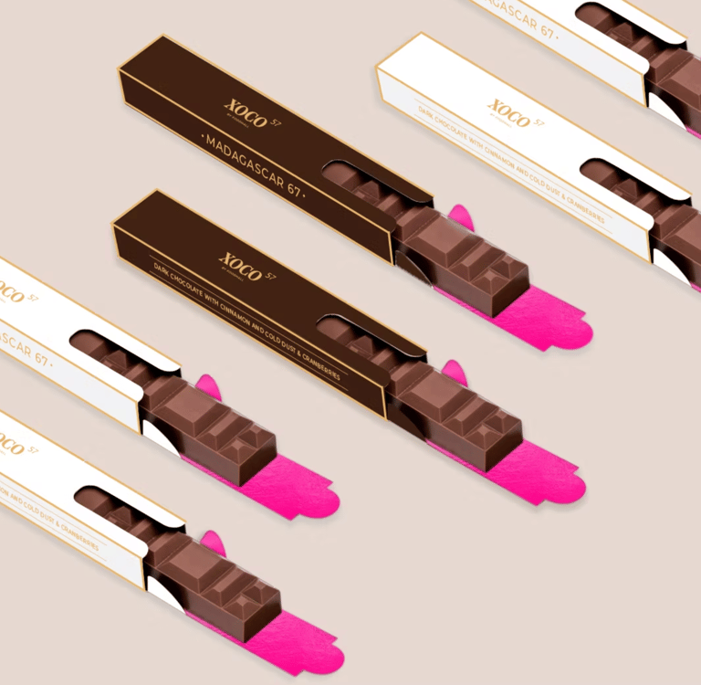
Xocolatl 57 is Foodhall's own premium chocolate brand. The brand allows you to craft your own chocolate bark and offers a hand-picked range of pure and distinct, single origin chocolates sourced from the world’s best producers from Ghana and Madagascar to Saint Dominique and Venezuela.
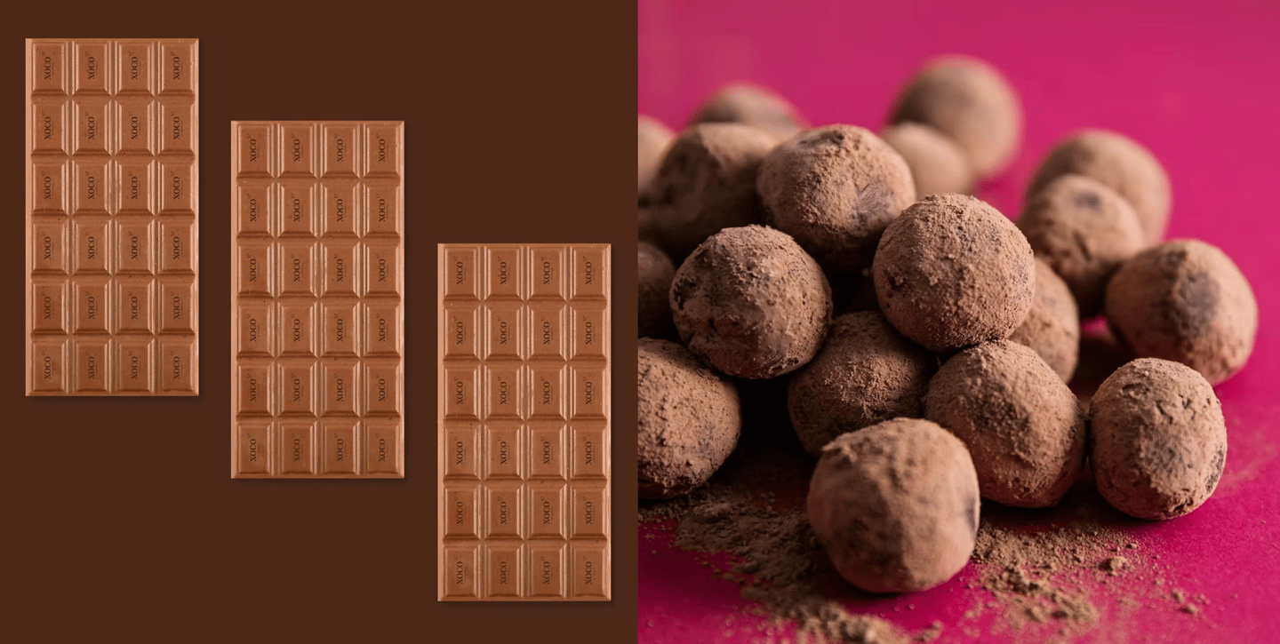
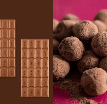
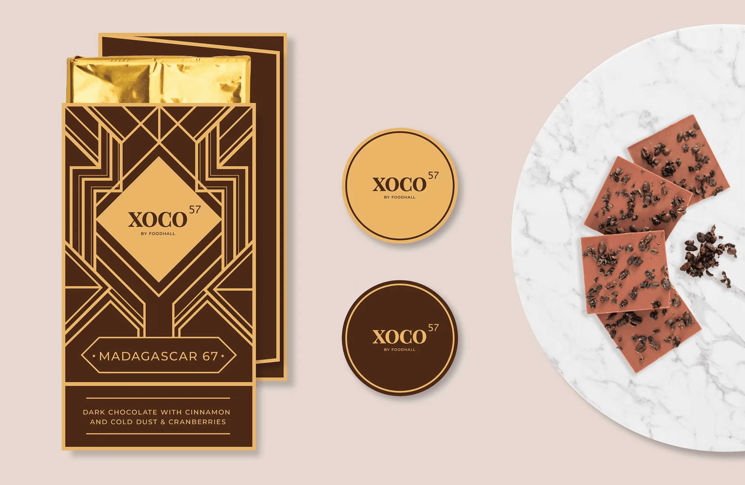
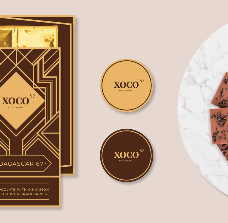
The brief was to develop packaging for their barks, bars and other chocolate variants. The brand needed to appear premium, luxurious and authentic. For this, a visual language inspired by art deco and aztec patterns was created. Recognised by its use of geometric shapes and clean lines this style was so closely tied with the feeling of sophistication, that it made the products seem one-of-a-kind or limited edition.