The State of Retention Marketing
Re-branding WebEngage's only Retention Podcast
The State of Retention Marketing (SORM)
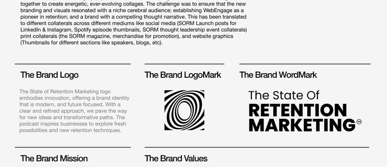
In a noisy world of growth hacks and one-time buyers, "The State of Retention Marketing" podcast is cutting through — elevating retention from an afterthought to a cornerstone. Our mission was clear: build a brand identity that doesn’t just support the podcast, but becomes the visual and emotional core of the retention conversation in e-commerce and SaaS.
SERVICES PROVIDED
VISUAL IDENTITY
BRAND STRATEGY
MARKETING GRAPHICS
Earlier Identity Problems
The State of Retention Marketing’s previous brand identity did not reflect its forward-thinking nature and future goals. As the podcast transitioned into a new phase, it faced key perception challenges and strategic shifts. Additionally, inconsistent internal use of the SORM branding contributed to a fragmented experience for external audiences.
In addition to its foundational attributes — Progressive, Focused, and Sincere — it became evident that SORM is fundamentally oriented around empowering customers to advance and transform their businesses. The brand identity needed to communicate its reliability and its role as an encouraging, enabling presence. By highlighting SORM’s key differentiators — deep expertise, genuine passion, and a strong sense of community — the goal was to position the brand with clarity and authority, firmly establishing its leadership within the category.
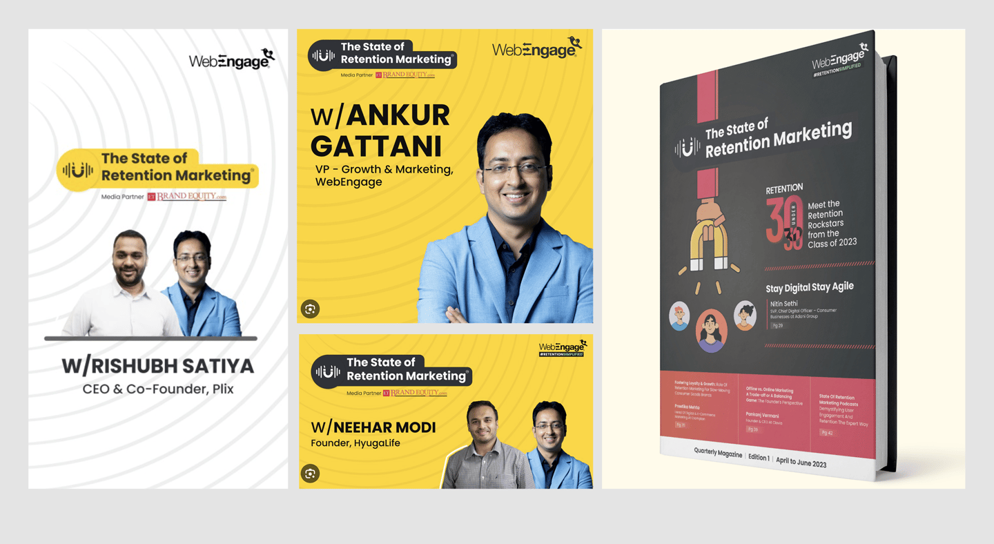
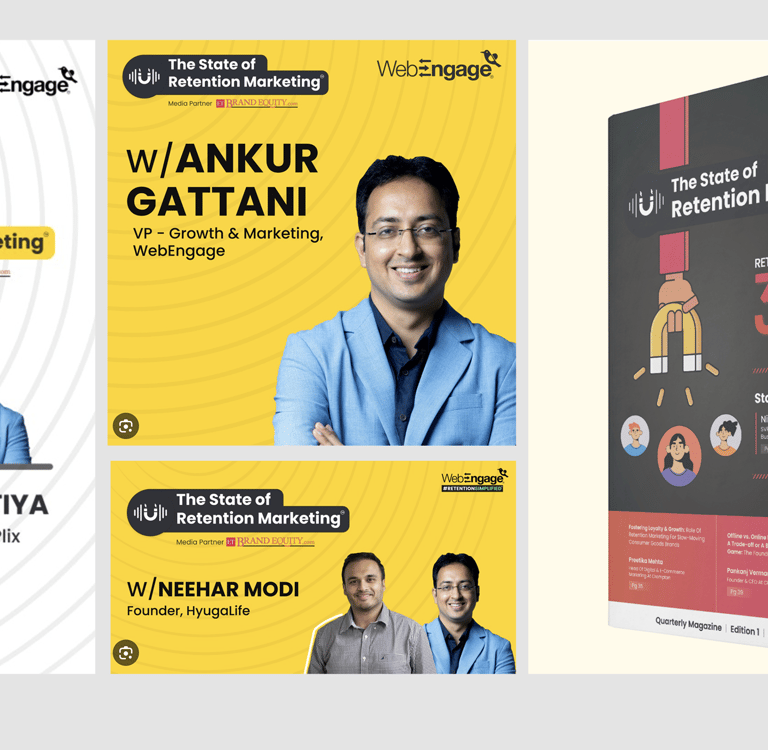

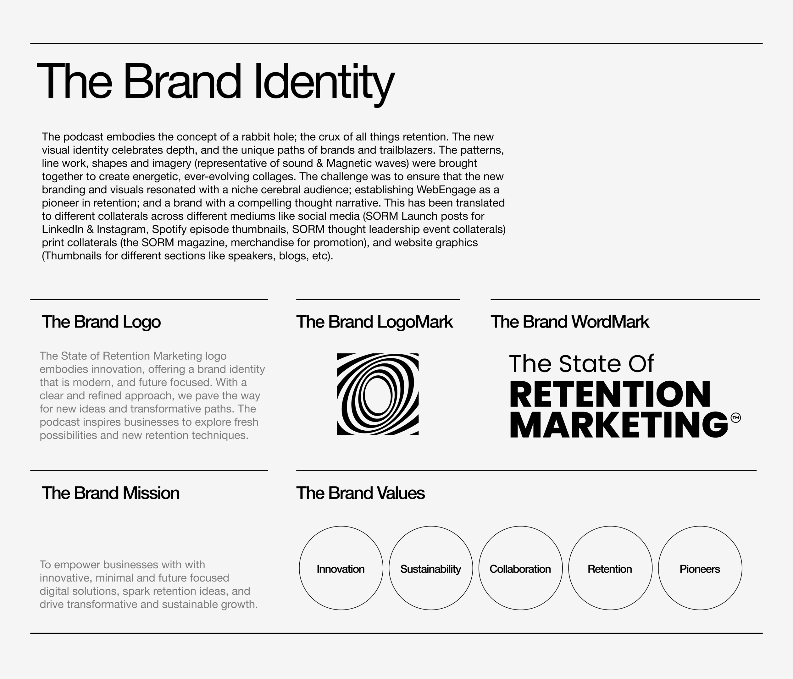
New Brand Identity

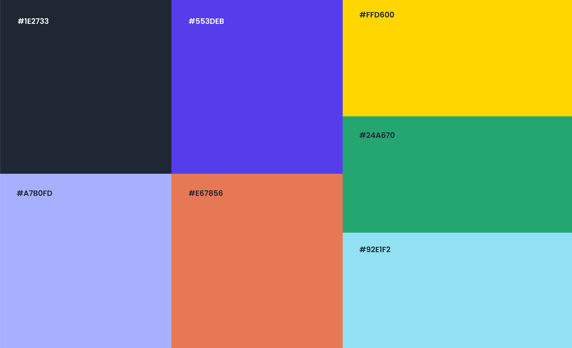
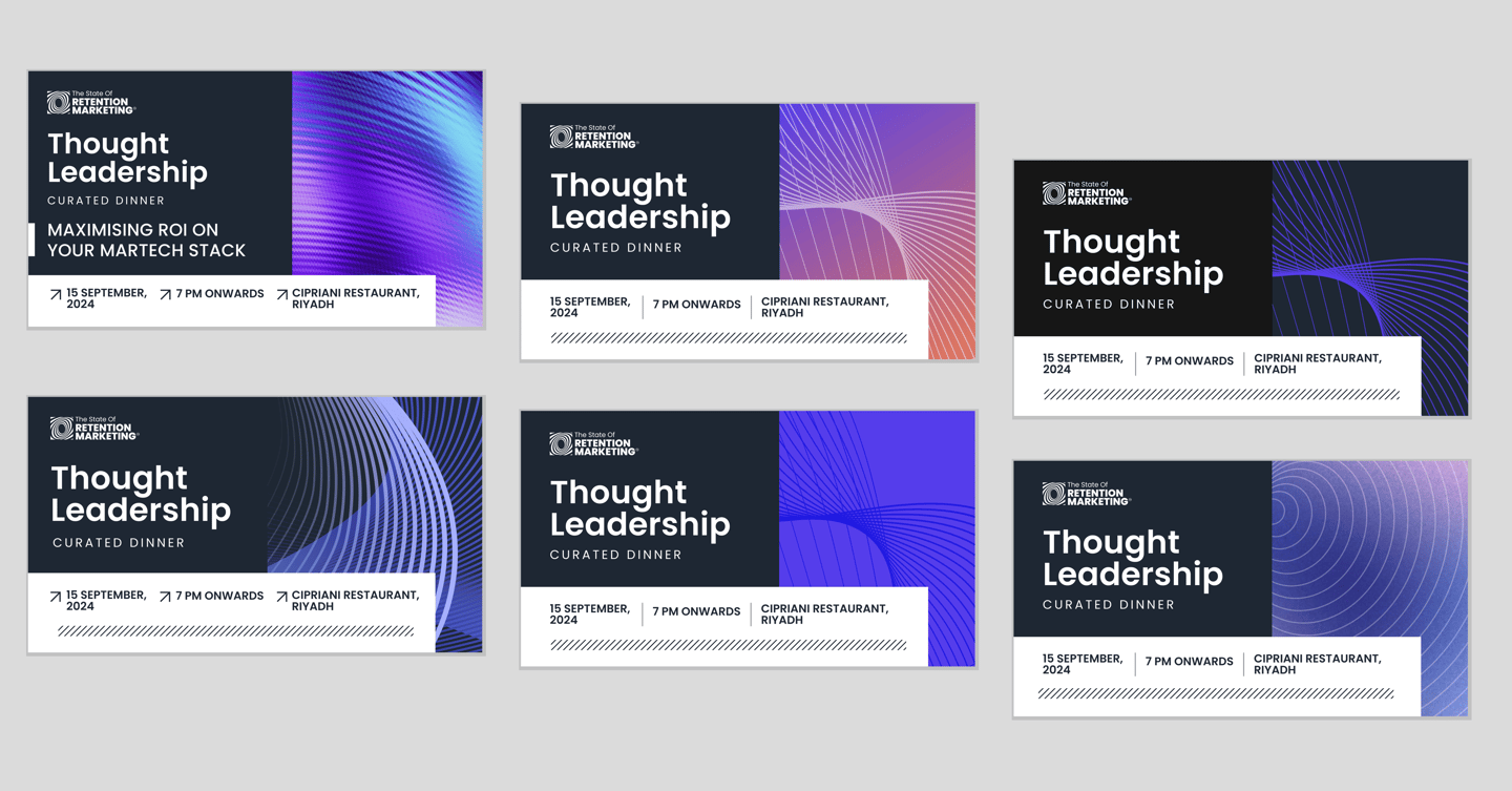
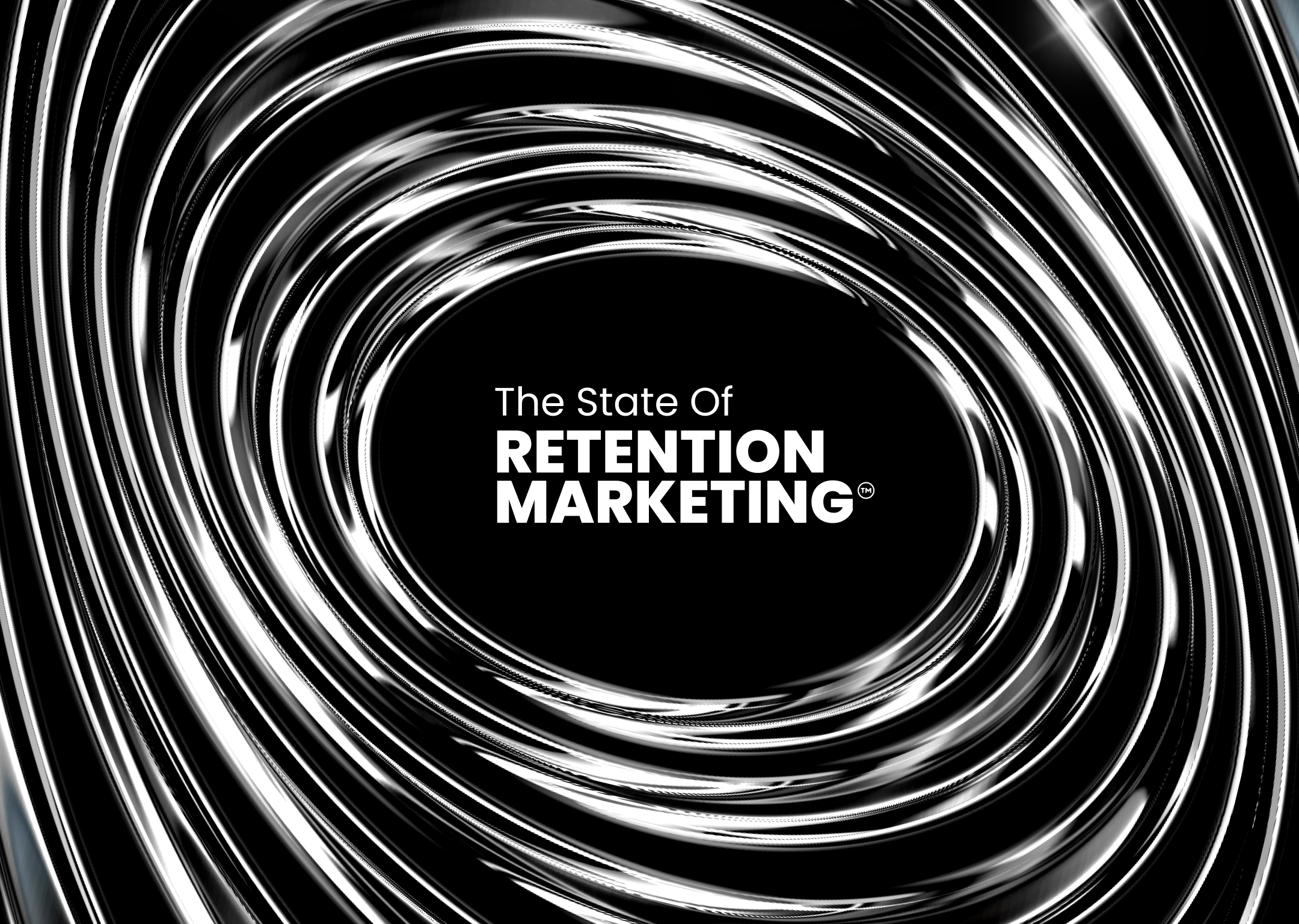
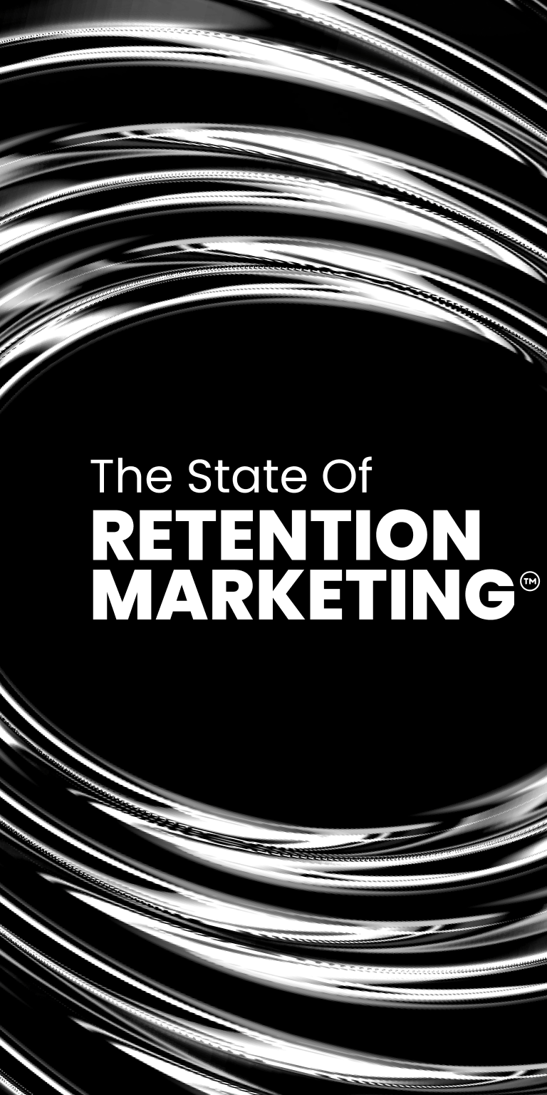
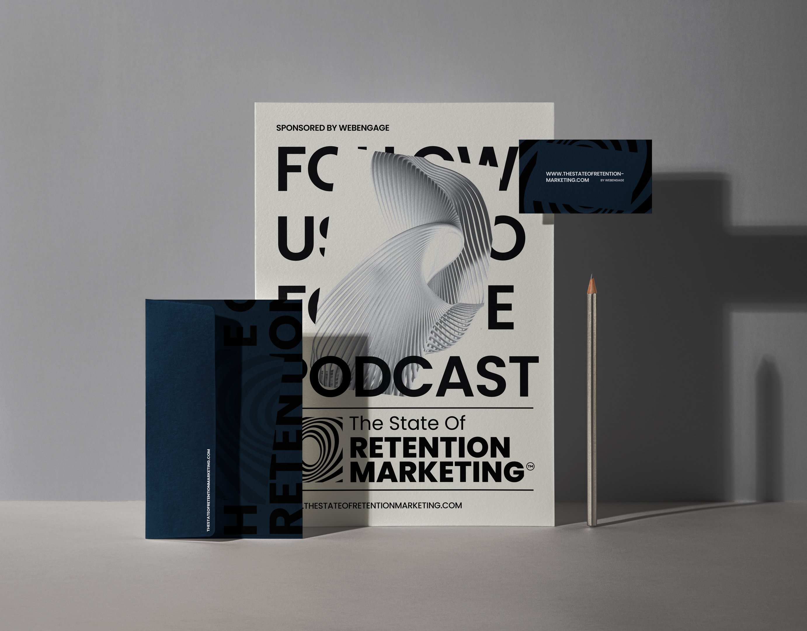
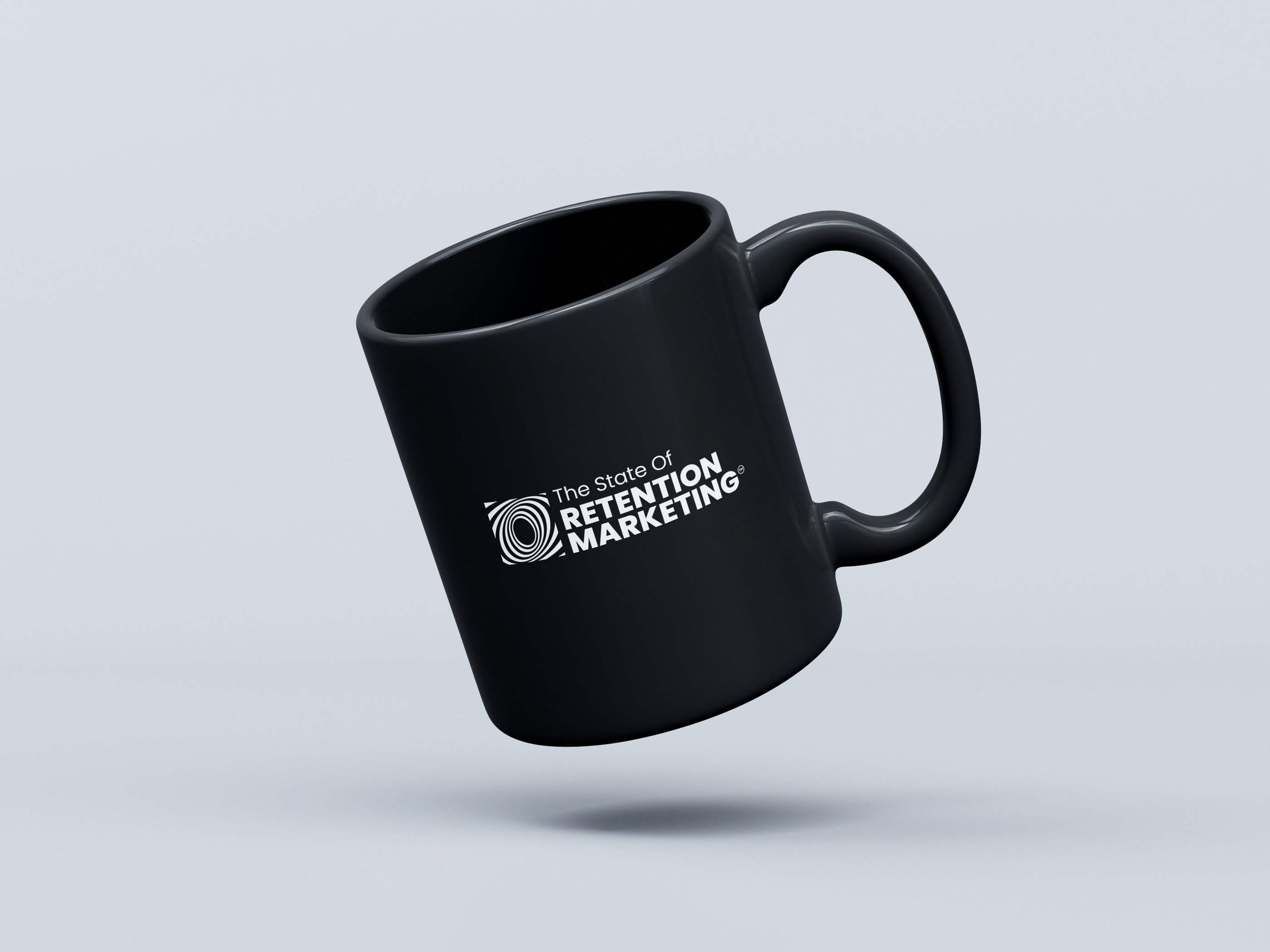
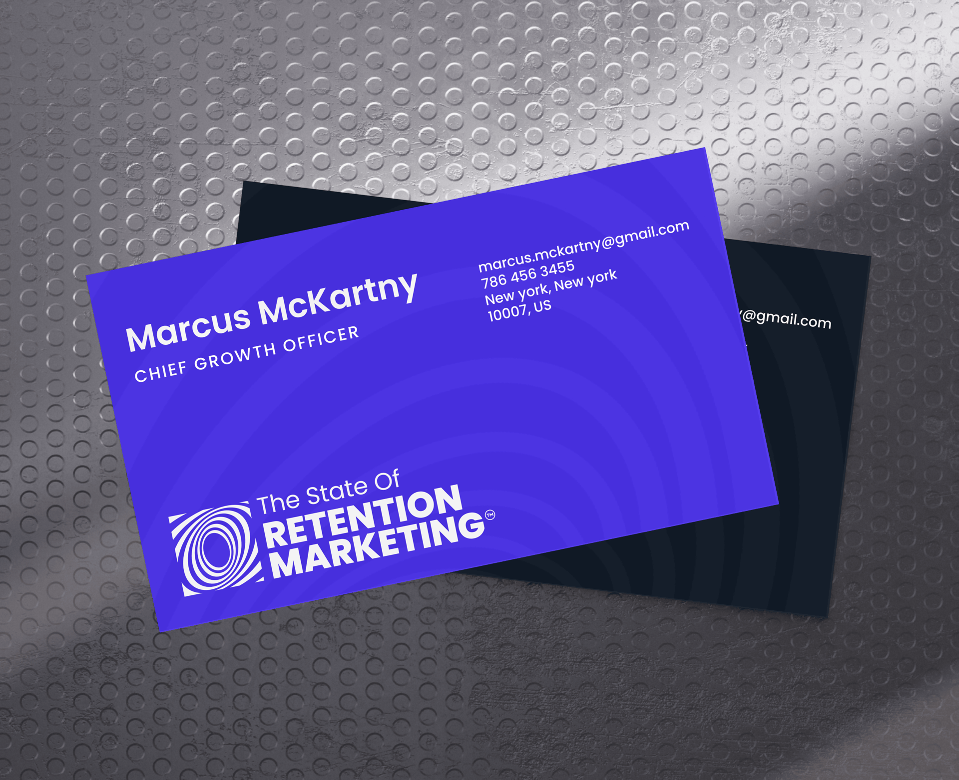
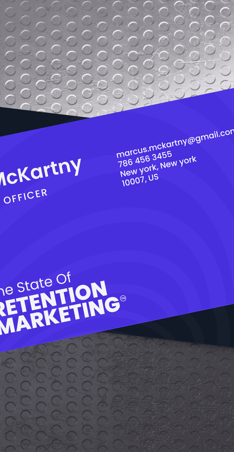
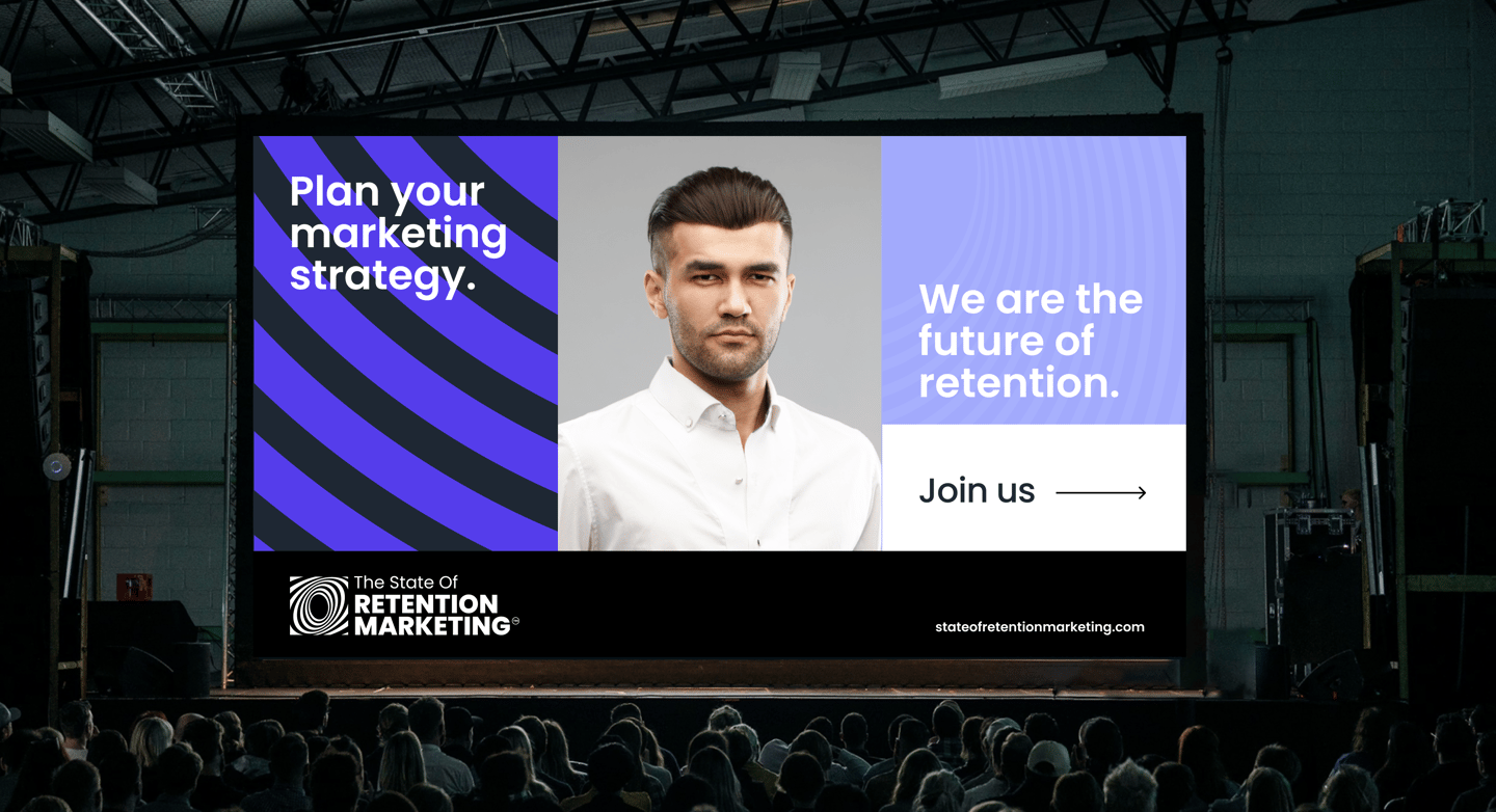
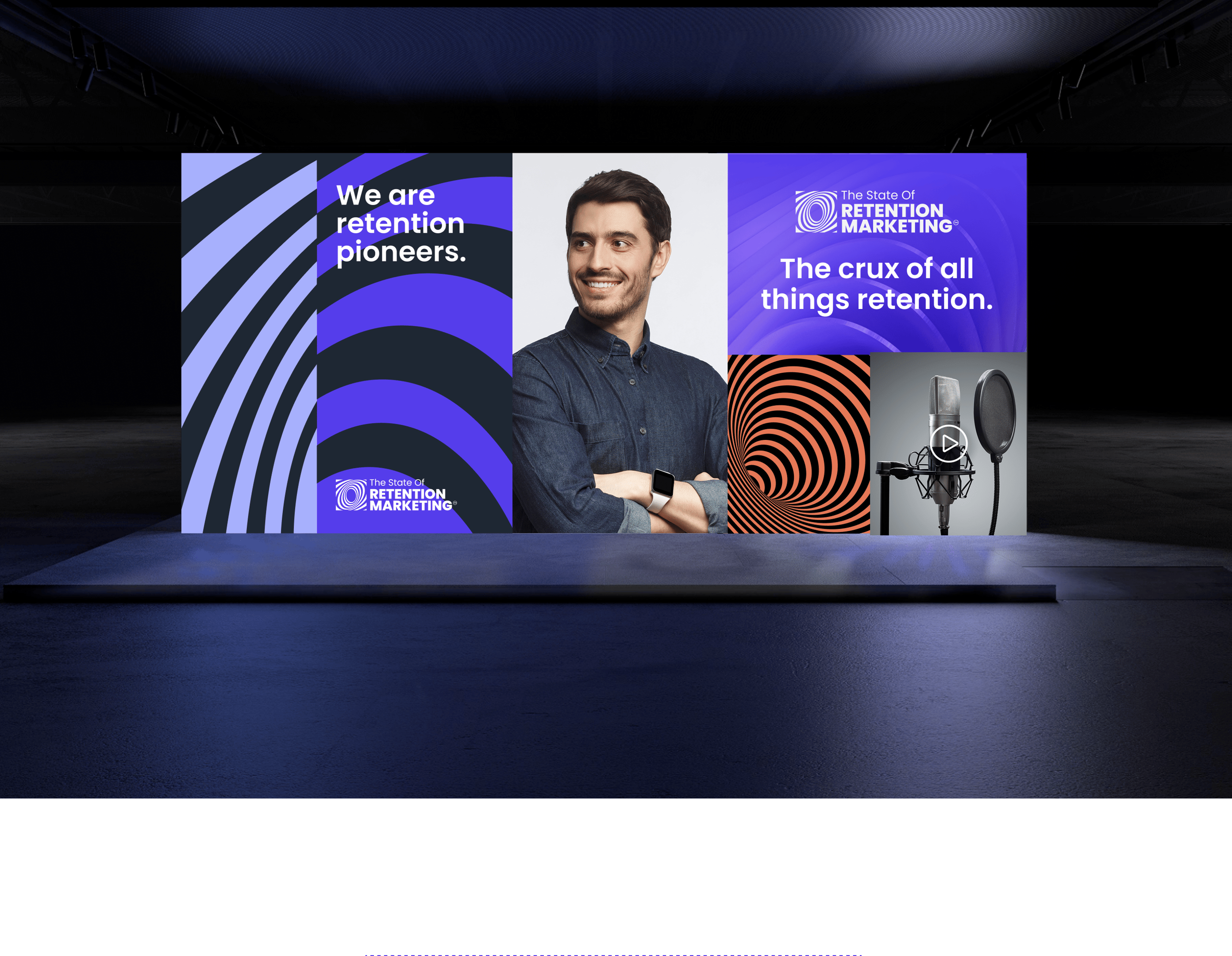
An immersive and modern brand experience was created, built around the principles of movement, clarity, and focus — reflecting the layered complexity and enduring influence of retention strategies.
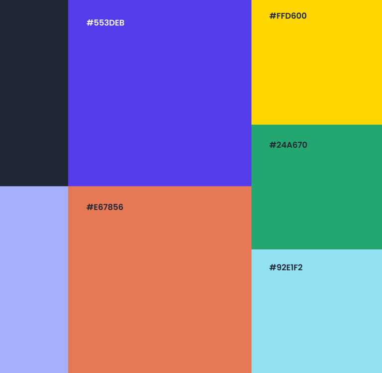
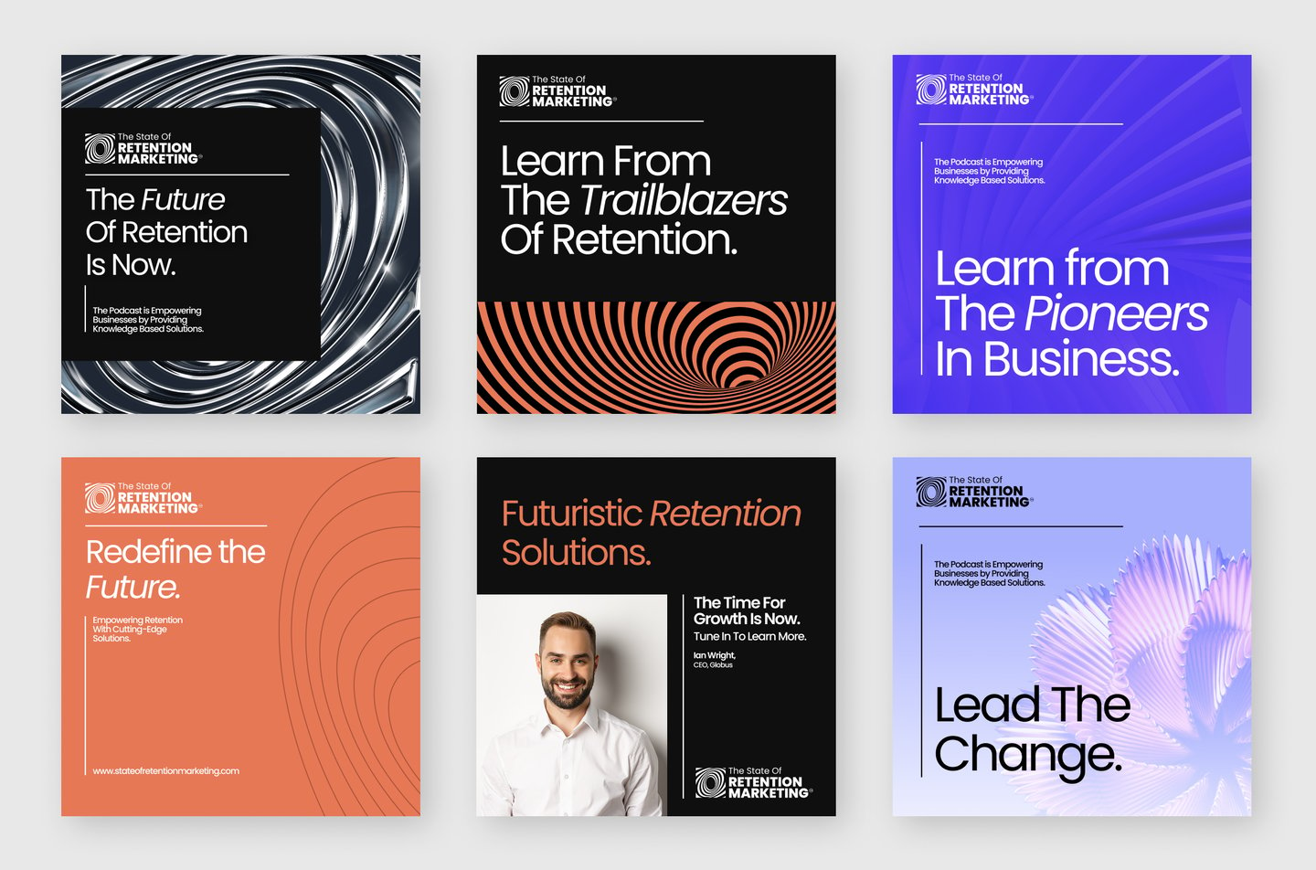
Color Scheme: Electric purples and deep grey black convey innovation and boldness, while orange overlays introduce strategic disruption, mirroring the way effective retention interrupts churn.
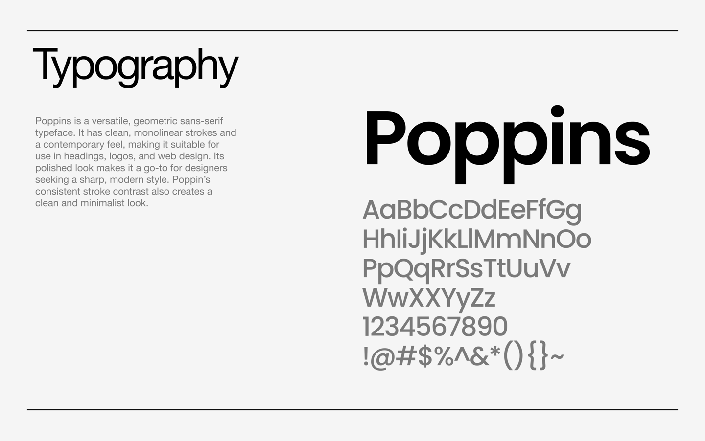
Typography: The bold, modern typeface project confidence while maintaining readability and accessibility across touchpoints.
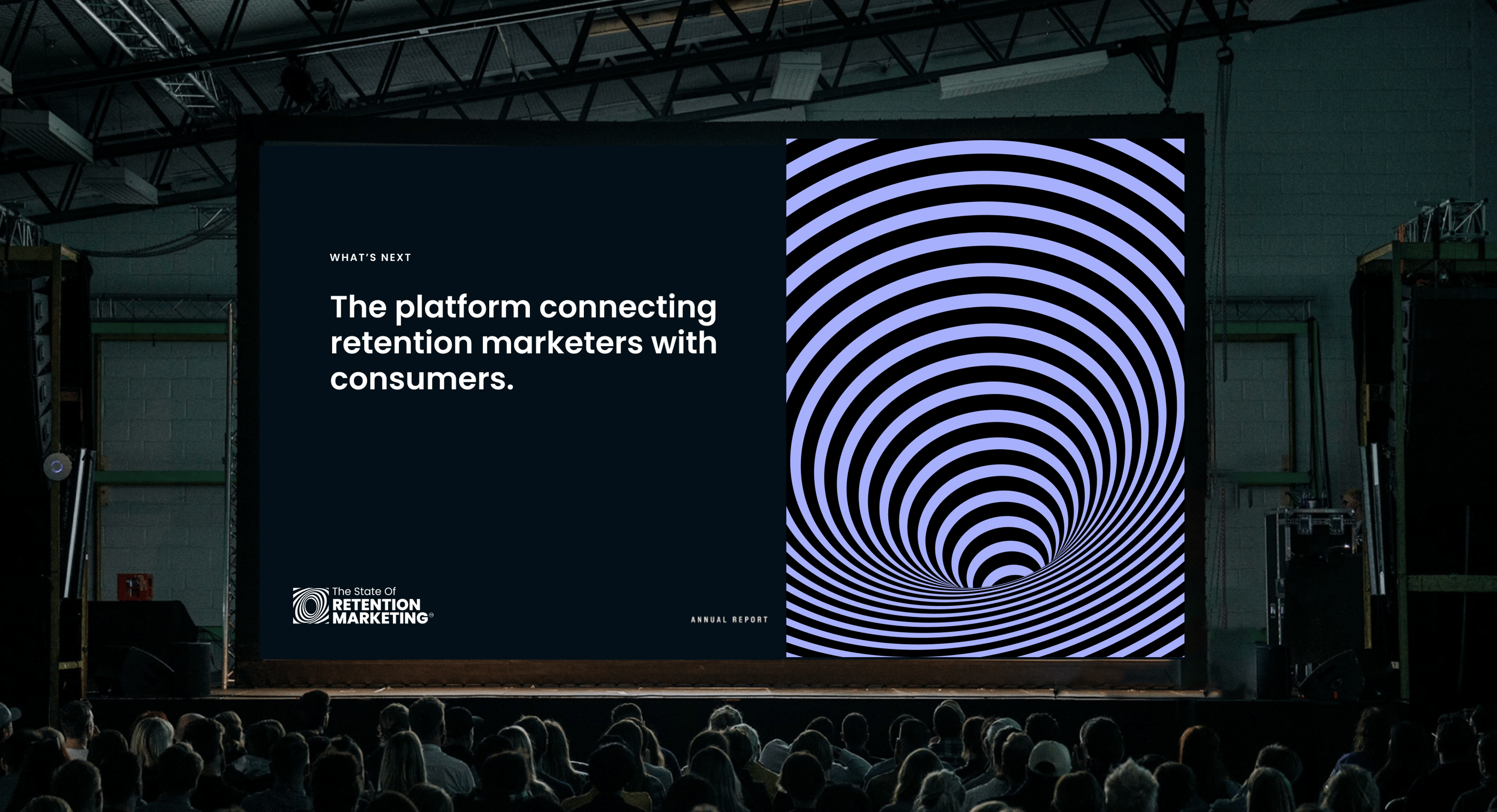
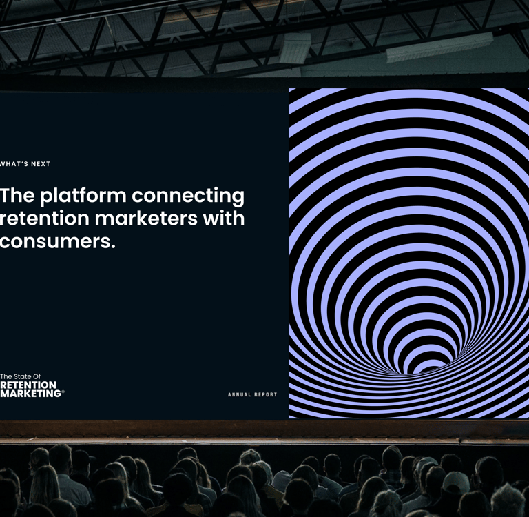
Patterns & Visual Motifs: Ripple-inspired graphics symbolize customer lifetime value and the compounding effect of retention. Hypnotic spirals subtly reference loyalty loops and ongoing engagement.
Photography & Human Element: A relatable, forward-looking host brings authenticity to the brand and reinforces a sense of trust and human connection.






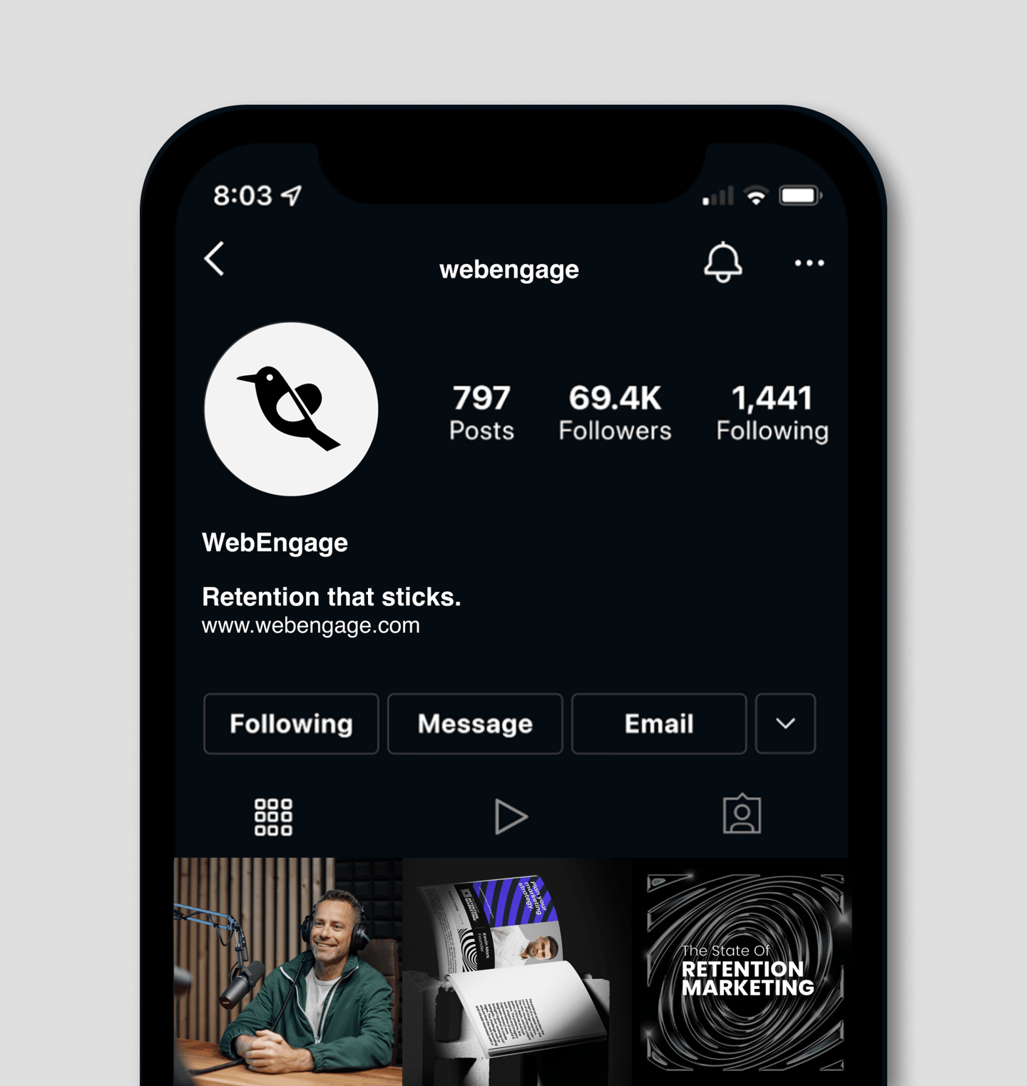
Social Media
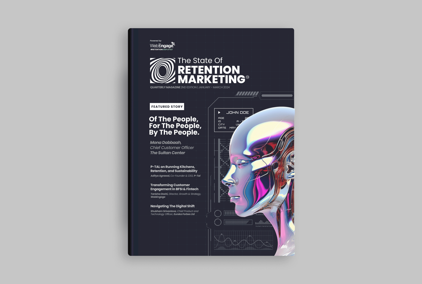
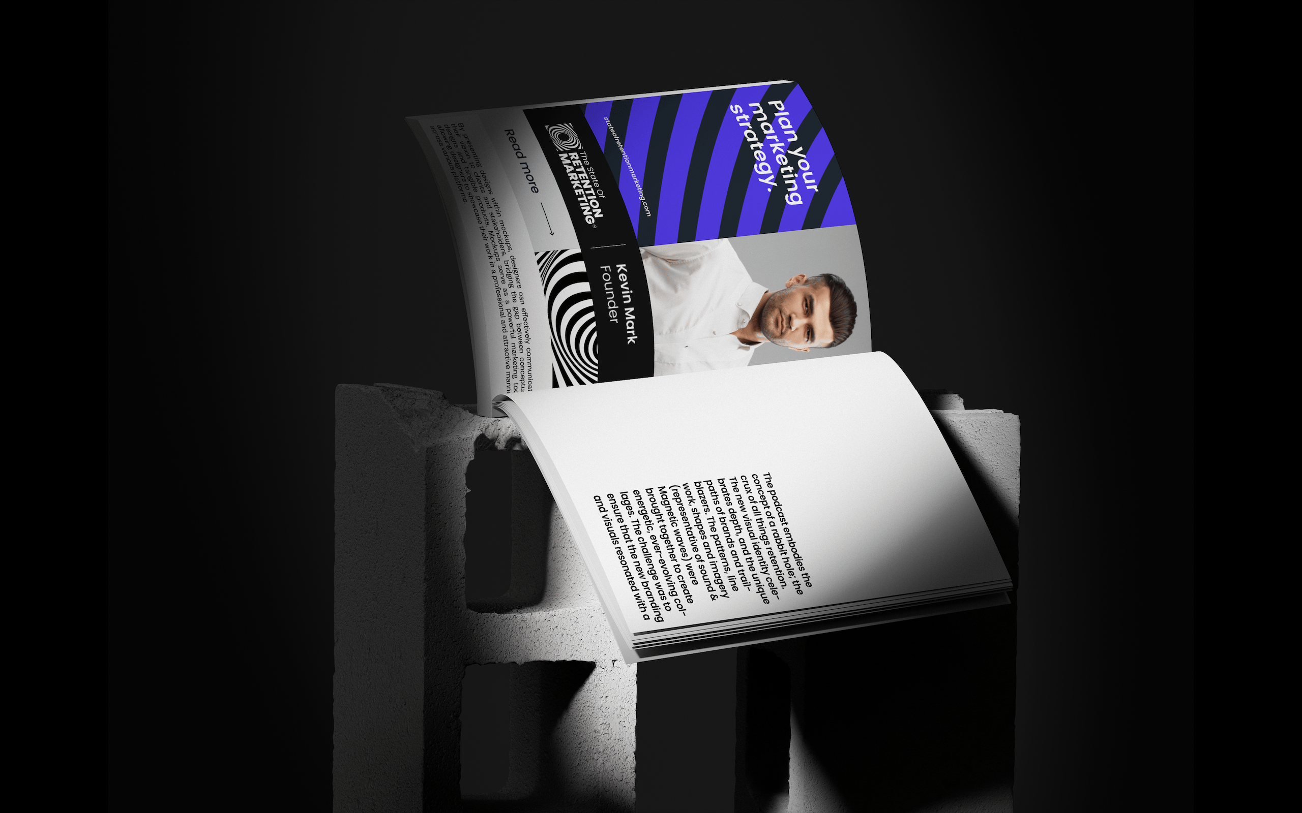
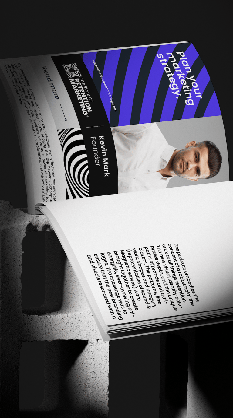
Magazine
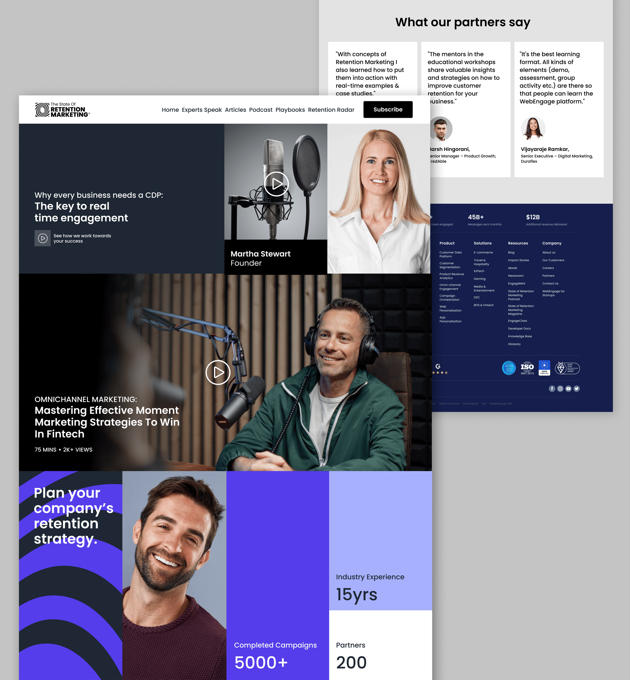
Proposed Website Page
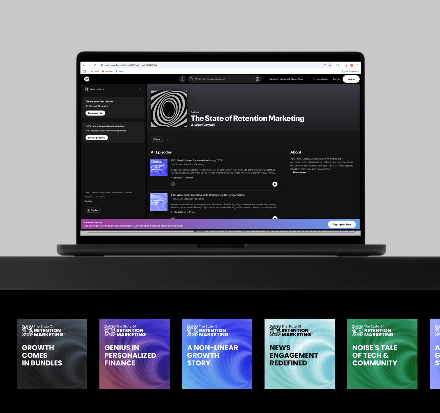
Spotify Podcast Page